Quote:
Originally Posted by Bingo

Wow ... 30 pages, that's great guys.
The more I've seen these things the more I think there will either be two winners, or one winner with a two logo design (change of the master). I like some of the rectangular logos for the top of the site, but I prefer a more square/round logo as well for things like the twitter account.
Lots to choose from.
|
This post from Bingo got me thinking about a way we could have the rectangle and the round, while having one Calgarypuck brand.
Full credit goes to Split 98 for the design but though this is a good way to combine my personal favourite design with the rectangle skyline theme that a lot of people here like:
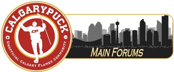
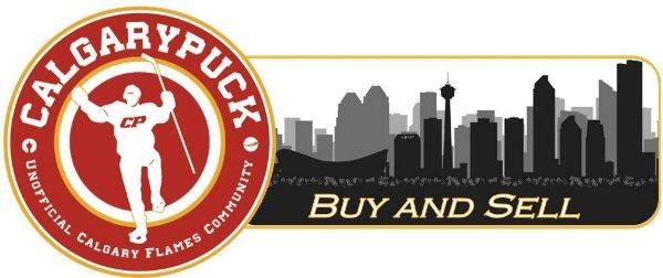
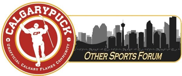
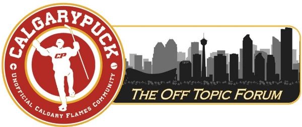
Have a main logo, with the rectangle skyline acting as a header telling you what sub-forum you are in.
You could do this with any of the round logos we have seen, just picked Split98s since it is my favourite.