Thanks for the positive feedback. Concerning the font controversy, I don't think that typeface is anywhere close to 'comic' as referred by some people. The proportions are actually quite conservative (see below), so perhaps it was because I skewed the numbers a bit (couldn't find an italic version of the font)

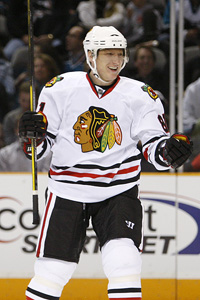
As for the proposed increase of logo size, I'm honestly not a big fan of giant logos mainly because... well this is quite a challenge to describe for a non-native speaker. I mean it gets distorted easily, so when the play is going on you rarelly see the original shape (perhaps with the exception of bigger goalie jerseys) and I don't like that.
In terms of proportions the flames logo is close to the Hawks logo and here's the comparison - I think it should be downsized to cca 90% of its current size.


Bigger isn't always better
