Though I'm in favor of keeping a small amount of black on our jerseys (previously posted Bastian Schmulling's concept is my favorite) recently I've been playing with retro ideas for slight modifications if the Flames decide to go full retro. Here is a concept I created:
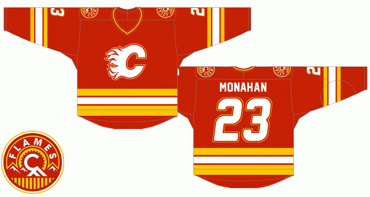
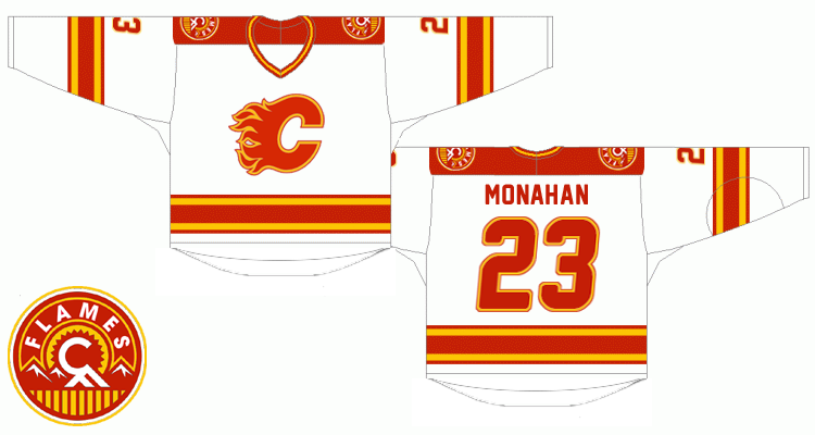
Notable changes:
* the red flaming C should be outlined the same way as it is on our current road jersey, yet using red instead of black. In order to unify the outlined look of the logo on both jerseys, the white flaming C would be quite a challenge to adapt but the red and yellow outline combo turned out to be good looking. Same for the numbers.
* Lettering - the goal was so that slighly italic and double outline numbers match the logo. As for the typeface itself, I've used the freeware 'New Athletic M54' font which IMHO combines the best of both worlds - sans-serif style from the original retro font and gently rounded corners from the new one.
* Squared off yokes are a bit contrversial but I found them perfectly fitting for Stars and Wild simplistic designs. It's one of those nice little modern touches I'd include, like them a lot.
* As for the shoulder patch, I was quite surprised when I photoshopped out the black because to me it looks sharper without it on both home and road uniforms
any thoughts ?