Quote:
Originally Posted by Split98

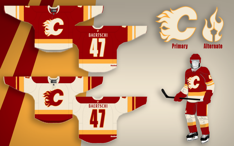
So I think I'm finally pretty happy with the concept. After playing around with the nameplate font, I found that I really did just love the clean (though Coyote's-esque) simple sans font. I also still never dug adding the extra band to the waist and included here is the neck-placement alternate logo that would be a great place if Reebok does end up allowing their branding relocation. I also retained the tie-ups, but decided on a jersey coloured thread to blend while keeping the (IMO) great look of a tie-up. Blends, avoids the clutter that bothered some people and adds that classic tie-up touch.
Thanks a lot for the positive response guys, this was definitely something I've had a ton of fun working on. |
I really don't get why everyone is so in love with these jerseys. There is too much white on the homes and the font looks terrible. I like the general design of the road jersey (save for the font) but I think people are getting a little TOO excited over this design. I don't know, it's kind of cheesy. Reminds me of the Dallas jerseys in the way that they're just kind of kid friendly, a little bit bubblegum, not classic enough to represent our history, and not stylish enough to be current. Not a lot of well thought out style, just a lot of "well look at THIS cool thing". Honestly, reminds me of the jerseys from the 90's. These are just a cheesy take on retro. Either go retro and tweak it, or do something different. This is somewhere kind of awkwardly in the middle.