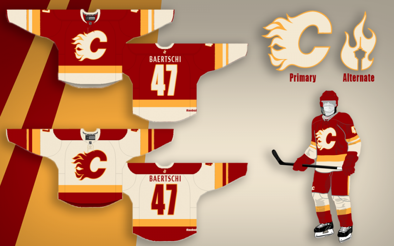
So I think I'm finally pretty happy with the concept. After playing around with the nameplate font, I found that I really did just love the clean (though Coyote's-esque) simple sans font. I also still never dug adding the extra band to the waist and included here is the neck-placement alternate logo that would be a great place if Reebok does end up allowing their branding relocation. I also retained the tie-ups, but decided on a jersey coloured thread to blend while keeping the (IMO) great look of a tie-up. Blends, avoids the clutter that bothered some people and adds that classic tie-up touch.
Thanks a lot for the positive response guys, this was definitely something I've had a ton of fun working on.