Love this concept.
I would make a couple edits.
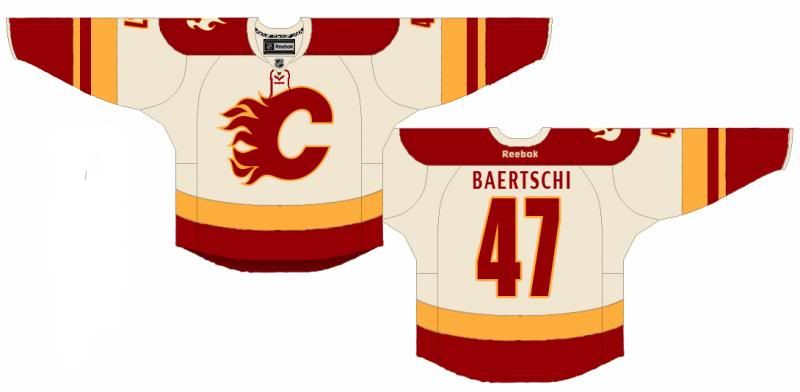
1. The name on the back needs a subtle change. Right now it is a similar typeface as what Phoenix uses, it's nice but not with the minimal design of this jersey.
2. Would love to see the alternate logo taken off the shoulder and a smaller version where the Reebok logo is. Reebok logo moved to the bottom center, maybe in the yellow stripe.
3. The laced neck makes the front a bit busy. Might look cleaner without them. Less is more...
But sweet design. This would be nice to combine it with my graphite concept as well for a 3rd...

Quote:
Originally Posted by Split98

And to finish off the concept, the away threads:
 |