Quote:
Originally Posted by red sky

The font is too small for the names but other than that, I like it a lot (the second one better)
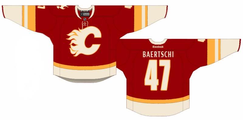
Edit: I also would like to see how it looks with a smaller yellow horizontal strip on the bottom instead of the larger one that you currently have. Perhaps the same size as the smaller strip on the sleeve, if that makes sense.
|
Thanks bud, and good call on the font.
Here it is with a thinner belt line. Personally, I dig the waist high yellow, but this also looks damn clean: