Figured this would come up again.
Nation divided?
Quote:
|
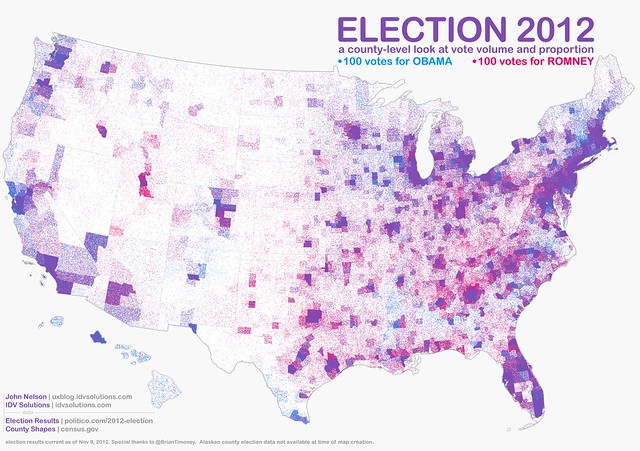
This is a mixed density visualization of the volume and proportion of votes in the 2012 US Presidential election. Each point represents 100 votes. This method avoids the geo-social visual bias of large geographic areas having small populations overwhelming the overall picture. In this way both the relative volume and geographic distribution are apparent, as well as the partisan proportions throughout. Areas of mixed voting appear as a blended purple cloud, while areas more heterogeneously represented appear more red or more blue.
|
http://uxblog.idvsolutions.com/2012/...l#comment-form
Mix the colors for Obama/Romney together and you get purple. Even in the supposed southern states that are so incredibly racist, the map is still purple.