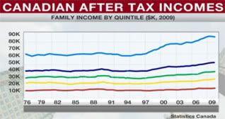
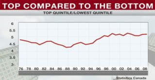
Here are some graphs from BNN
Showing after tax income by quintile
Showing the multiple difference between the top and bottom quintile. (y-axis values should be shifted one spot down)
\
The gap did widen in the mid-nineties, with the top 20% making 5.6x more then the bottom 20% compared compared to ~5.2x in the later seventies.