Quote:
Originally Posted by Russic

Just watching the video in the article of Steve announcing OSX. Were they using comic sans in their presentations? Seems really out of place for such a design focused company. Also notice they use the same gradient background slides for the presentation.
|
People always give Apple design too much credit. They have very simplistic monolithic themes and just apply them to everything.
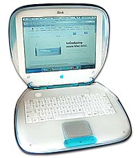
1999-2000 was a strange time for Apple. They were going after the whole candy/gel/cute/translucent/friendly plastic/fisher price look to their computers and software. The font and presentation fits into that theme because they were trying desperately to reinvent themselves and differentiate themselves from the rest of the business by being more consumer friendly and "cute" for a lack of a better word. This was before the iPod and Apple wasn't as financially stable and Jobs coming back was seen as radical. Since then, you can see the designs being clawed back to a minimalist/modern/professional look which is for the better. At the time though, it put money into Apple's pockets as more families and schools and previous non-computer users bought iMacs and iBooks, etc. for the new fangled thing of surfing the net, etc. You have to remember the state of computer and internet adoption only 10 years ago was radically different.
^^^
This is another reason why OSXI maybe needs to come out because the current aqua evolved designs were still conceptualized to match the hardware scheme when it used to look like that!