 09-04-2015, 09:14 AM
|
#21
|
|
Franchise Player
Join Date: Jul 2009
Location: Red Deer
|
They over-compensated for their last atrocity of hockey apparel:
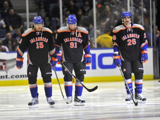
Maybe, deep down, they just really wish they were a basketball team? Trans-sported?
__________________
"It's a great day for hockey."
-'Badger' Bob Johnson (1931-1991)
"I see as much misery out of them moving to justify theirselves as them that set out to do harm."
-Dr. Amos "Doc" Cochran
|

|

|
|
09-04-2015, 09:17 AM
|
#22
|
|
Franchise Player
Join Date: Aug 2007
Location: Vancouver
|
It will look better with numbers, but is still pretty plain. Hopefully they can figure out a shoulder patch to throw on there as well.
I understand them wanting to go with the "Brooklyn" colors, but I wish they put a little more of the blue and orange on it (it looks like the Cup stripes on the Y are still colored). I think thin lines of blue/orange mixed in with the white arm stripes, as well as colored borders on numbers would look good.
__________________

|
|
|
|
|
09-04-2015, 09:30 AM
|
#23
|
|
In the Sin Bin
|
Nets colors?
Broooooooklyn
|
|
|
|
|
09-04-2015, 10:06 AM
|
#24
|
|
In the Sin Bin
|
That is complete garbage. It makes the Oilers' old half-finished RBK Edge jerseys look good in comparison.
|
|
|
|
|
09-04-2015, 10:08 AM
|
#25
|
|
First Line Centre
|
Looks like a community hockey or practice jersey.
|
|
|
|
|
09-04-2015, 10:09 AM
|
#26
|
|
Atomic Nerd
Join Date: Jul 2004
Location: Calgary
|
Looks straight outta compton.
|
|
|
|
|
09-04-2015, 10:27 AM
|
#27
|
|
Powerplay Quarterback
|
I see gold and white stripes! What is wrong with my eyes?!
|
|
|
|
|
The Following 8 Users Say Thank You to Stud_McCool For This Useful Post:
|
|
|
09-04-2015, 10:56 AM
|
#28
|
|
First Line Centre
Join Date: Jul 2010
Location: Calgary
|
I guess black is the new orange
__________________
|
|
|
|
|
09-04-2015, 11:01 AM
|
#29
|
|
Franchise Player
Join Date: Jul 2010
Location: Barthelona
|
I dig it. Pretty minimalistic, which can sometimes be a nice change of pace.
__________________
Quote:
Originally Posted by snipetype

k im just not going to respond to your #### anymore because i have better things to do like #### my model girlfriend rather then try to convince people like you of commonly held hockey knowledge.
|
|
|
|
|
|
09-04-2015, 11:16 AM
|
#30
|
|
#1 Goaltender
|
I like what they were going for, but it's just missing something.
The collar needs to be changed and
It needs some bottom striping.
|
|
|
|
|
09-04-2015, 01:40 PM
|
#31
|
|
Franchise Player
Join Date: Dec 2011
Location: Calgary
|
Terrible. The last thing the NHL needs is less colour.
|
|
|
|
|
09-04-2015, 01:46 PM
|
#32
|
|
First Line Centre
Join Date: Apr 2008
Location: Port Moody BC
|
Love it. Looks really sharp.
|
|
|
|
|
09-04-2015, 01:49 PM
|
#33
|
|
Franchise Player
Join Date: Mar 2007
Location: Income Tax Central
|
Its okay but its no fisherman performing lude acts upon a barrel.
__________________
The Beatings Shall Continue Until Morale Improves!
This Post Has Been Distilled for the Eradication of Seemingly Incurable Sadness.
If you are flammable and have legs, you are never blocking a Fire Exit. - Mitch Hedberg
|
|
|
|
|
09-04-2015, 01:49 PM
|
#34
|
|
Franchise Player
Join Date: Feb 2006
Location: Calgary
|
Lol, looks like a cheap practice jersey off the rack of Walmart or Canadian Tire. Terrible.
|
|
|
|
|
09-04-2015, 01:52 PM
|
#35
|
|
Franchise Player
Join Date: Mar 2004
Location: Calgary
|
Dark blue with orange NY would have been cool
__________________
REDVAN!
|
|
|
|
|
09-04-2015, 03:43 PM
|
#36
|
|
Franchise Player
|
came to the thread to see an ugly jersey, left satisfied.
|
|
|
|
|
09-04-2015, 04:53 PM
|
#37
|
|
Franchise Player
Join Date: Sep 2002
Location: I'm right behind you
|
Quote:
Originally Posted by YYC in LAX
I guess black is the new orange
|
Your joke is bad and you should feel bad.
__________________
Don't fear me. Trust me.
|
|
|
|
|
The Following User Says Thank You to Reaper For This Useful Post:
|
|
|
09-05-2015, 10:51 AM
|
#38
|
|
Powerplay Quarterback
Join Date: Sep 2007
Location: Behind enemy lines!
|
I hate those toilet seat collars.Some NFL jerseys have it too.
 
|
|
|
|
|
09-05-2015, 05:33 PM
|
#39
|
|
Backup Goalie
Join Date: Feb 2011
Location: yyc
Exp: 
|
 Islanders third jersey leaked
Nice for a seldom used 3rd jersey, but I wouldn't want to see it regularly
Sent from my iPhone using Tapatalk
|
|
|
|
|
09-05-2015, 05:49 PM
|
#40
|
|
Franchise Player
Join Date: Oct 2001
Location: Clinching Party
|
The Islanders are turning into the Canucks with their constant dicking around with their look, even though they've always had a cool color scheme and history to go with it.
We knew this black/white look was coming, but that doesn't mean it doesn't suck. And since I seriously doubt they are going to to with white pants, they are going to go with black pants.
The 1999 Kings called, and they said "put some goddamn stripes and numbers on the arms if you are going to do this".
I love the orange/blue stripe on the inside of the jersey though. Some PR flack will say something about "respecting the history with a nod to the Isles traditional colors". Sure, and I respect my great uncle George by keeping a picture of him in a box.
Why is this making me angry? Is it the weather? It might be the weather. I don't really care about the Islanders gear, but here I am bitching about it.
Last edited by RougeUnderoos; 09-05-2015 at 05:52 PM.
|
|
|
|
 Posting Rules
|
You may not post new threads
You may not post replies
You may not post attachments
You may not edit your posts
HTML code is Off
|
|
|
All times are GMT -6. The time now is 12:31 AM.
|
|


