|
View Poll Results: I _______ the new Flames jerseys
|
|
like
|
   
|
111 |
20.52% |
|
don't like
|
  
|
219 |
40.48% |
|
don't care about
|
  
|
211 |
39.00% |
|
The Following 9 Users Say Thank You to tvp2003 For This Useful Post:
|
|
 06-23-2017, 07:49 PM
|
#122
|
|
Draft Pick
|
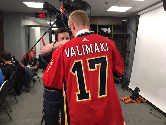
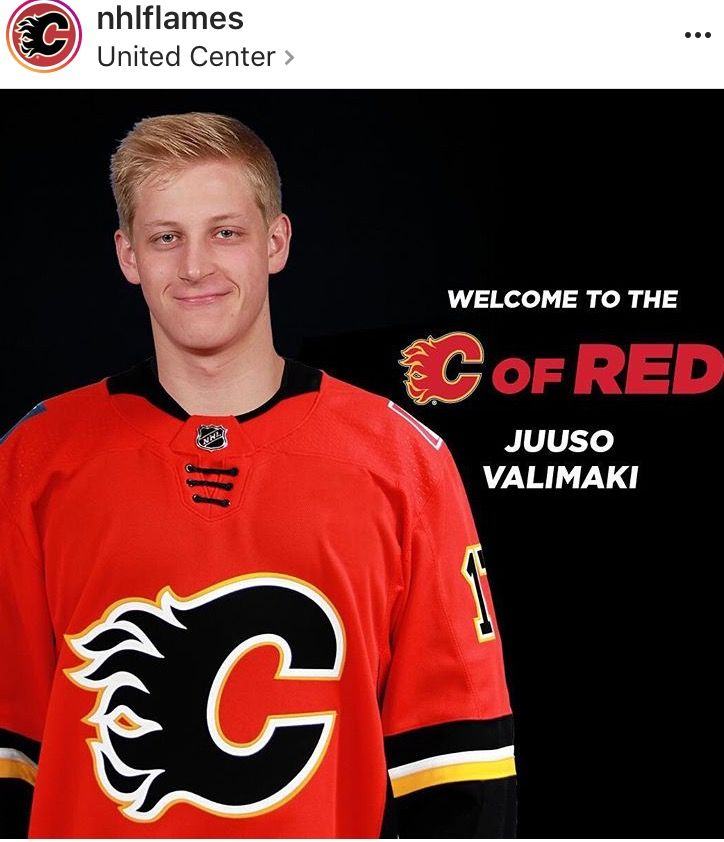
The numbers are larger than the previous jerseys. Not sure if I like that or not.
|

|

|
|
06-23-2017, 08:16 PM
|
#123
|
|
First Line Centre
Join Date: Oct 2009
Location: Reppin' the C in BC
|
The blue flag just does not fit from what I can see on Valimaki jersey 
|
|
|
|
|
06-23-2017, 08:45 PM
|
#125
|
|
Crash and Bang Winger
|
Looks like the numbers (and I assume letters?) are layered twill, as opposed to the single-layer sublimated look from the Adidas reveal on Tuesday.
|
|
|
|
|
06-23-2017, 09:05 PM
|
#126
|
|
Lifetime Suspension
|
Quote:
Originally Posted by IrishSpring2013

|
Yes it's squished. The white part should be a perfect square but is off by a centimetre. Neither flag is accurate, the shield is too big on the Alberta flag, and the dimensions are way off on both.
I think the flags on the the replicas are more accurate, but Ive never owned one so couldnt say for sure.
|
|
|
|
|
06-23-2017, 09:34 PM
|
#127
|
|
First Line Centre
|
Quote:
Originally Posted by Insane_Flame
I always thought these would be cool. Found this on my saved on my desktop from a while ago. Could you a little more yellow, but I would buy them. 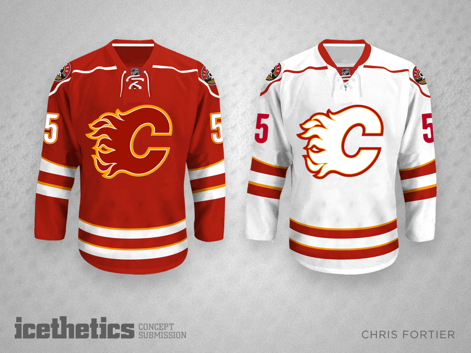 |
If these became the jerseys, it would be the end of the C of Red. So many of the white jersey would sell...love it!
|
|
|
|
|
The Following User Says Thank You to Ace For This Useful Post:
|
|
|
06-23-2017, 09:36 PM
|
#128
|
|
First Line Centre
Join Date: Oct 2009
Location: Reppin' the C in BC
|
Quote:
Originally Posted by Insane_Flame
I always thought these would be cool. Found this on my saved on my desktop from a while ago. Could you a little more yellow, but I would buy them. |
Quote:
Originally Posted by Ace
If these became the jerseys, it would be the end of the C of Red. So many of the white jersey would sell...love it!
|
i would actually end up getting both if it ever happened.
|
|
|
|
|
The Following 2 Users Say Thank You to Reign of Fire For This Useful Post:
|
|
|
06-23-2017, 09:40 PM
|
#129
|
|
Scoring Winger
Join Date: Apr 2015
Location: The Corral
|
The laces look worse when the jersey is actually worn, looks terrible IMO
__________________
"They canned a head coach, the GM is on the firing line, they're 12th in the West and just lost at home to the last place team in the NHL.
And (I am not making this up) statistically this is the Edmonton Oilers fourth best season in the last 13 years." via Rob Tychkowski's Twitter 1-23-2019
|
|
|
|
|
06-23-2017, 09:56 PM
|
#130
|
|
All I can get
|
Tieless laces are a pretty dumb jersey accoutrement.. Might as well have a faux bow tie.
Collar is pretty weird too.
|
|
|
|
|
The Following 3 Users Say Thank You to Reggie Dunlop For This Useful Post:
|
|
|
06-23-2017, 10:50 PM
|
#131
|
|
First Line Centre
Join Date: Dec 2003
Location: CALGARY!
|
Quote:
Originally Posted by Insane_Flame
I always thought these would be cool. Found this on my saved on my desktop from a while ago. Could you a little more yellow, but I would buy them. |
Yes this is what I was imagining! I would ditch the yellow completely though. White on white with red trim and red on red with white trim. Could even swap logo coulours (red C on white). Basically I hate the yellow and think it should go. That white on white (with no yellow) would be very appealing and look extremely slick on the ice. Alas we have a team run by tools and this will never happen.
__________________
Stanley Cup - 1989
Clarence Campbell Trophy - 1986, 1989, 2004
Presidents Trophy - 1988, 1989
William Jennings Trophy - 2006
Last edited by The Familia; 06-23-2017 at 10:55 PM.
|
|
|
|
|
06-23-2017, 11:54 PM
|
#132
|
|
Crash and Bang Winger
Join Date: Aug 2007
Location: Calgary, AB
|
Quote:
Originally Posted by Stanley
I'd like these but with a white C on home, red C on Away
|

Touched it up for fun. I agree, the white on white looks kind of cool... but I don't think it works for a jersey. And this is coming from a guy who really likes the red on red...
|
|
|
|
|
The Following 3 Users Say Thank You to DT77 For This Useful Post:
|
|
|
06-24-2017, 12:00 AM
|
#133
|
|
Crash and Bang Winger
Join Date: May 2009
Location: Calgary
|
Now that I've seen an actual nameplate and the actual numbers on this new jersey - I'm actually warming to the side vertical stripes a bit as the removal of the italics makes such a big difference. Surprised. If only they would have substituted the flags for the new shoulder patch roundel I think this uni would have been a real winner. Such a shame.
__________________
The Doctor is in
|
|
|
|
|
The Following User Says Thank You to Dr. Pepper For This Useful Post:
|
|
|
06-24-2017, 04:08 AM
|
#134
|
|
Resident Videologist
Join Date: Mar 2002
Location: Calgary
|
I voted "like" because I think the jersey is a step in the right direction from last year's with the few subtle changes.
Though I really wish they eliminated the weird drawstring and switched out the shoulder logos. Those changes alone make it much better IMO:

|
|
|
|
|
The Following 20 Users Say Thank You to AC For This Useful Post:
|
Art Vandelay,
davidus_49,
devel,
devo22,
Dr. Pepper,
drewtastic,
FanIn80,
fanman,
FBI,
FlameFan21,
getbak,
goodyear,
GreenLantern2814,
MisterJoji,
roberts10,
sec304,
tvp2003,
Tyler,
united,
YYC in LAX
|
|
06-24-2017, 04:18 AM
|
#135
|
|
Franchise Player
Join Date: Feb 2006
Location: Calgary, AB
|
It also looks like the logo is quite a bit lower than before.


__________________
Turn up the good, turn down the suck!
|
|
|
|
|
06-24-2017, 07:02 AM
|
#136
|
|
Scoring Winger
Join Date: Feb 2013
Location: Lethbridge
|
Quote:
Originally Posted by getbak
It also looks like the logo is quite a bit lower than before.
|
Yeah...kind of seems weird.
Sent from my XT1563 using Tapatalk
|
|
|
|
|
06-24-2017, 07:17 AM
|
#137
|
|
Scoring Winger
|
Quote:
Originally Posted by getbak
It also looks like the logo is quite a bit lower than before.
|
Making space for ads
Sent from my iPhone using Tapatalk
|
|
|
|
|
06-24-2017, 07:55 AM
|
#138
|
|
First Line Centre
Join Date: Feb 2010
Location: Calgary
|
nm
Last edited by Regular_John; 06-24-2017 at 07:59 AM.
|
|
|
|
|
The Following User Says Thank You to Regular_John For This Useful Post:
|
|
|
06-24-2017, 08:01 AM
|
#139
|
|
Powerplay Quarterback
Join Date: Mar 2016
Location: Calgary
|
I dont mind them.i do wish they where better
|
|
|
|
|
06-24-2017, 09:16 AM
|
#140
|
|
Scoring Winger
Join Date: Feb 2013
Location: Lethbridge
|
Quote:
Originally Posted by getbak
It also looks like the logo is quite a bit lower than before.
|
Yeah...kind of seems weird.
Sent from my XT1563 using Tapatalk
|
|
|
|
 Posting Rules
|
You may not post new threads
You may not post replies
You may not post attachments
You may not edit your posts
HTML code is Off
|
|
|
All times are GMT -6. The time now is 04:06 AM.
|
|