08-23-2014, 12:32 PM
|
#601
|
|
Franchise Player
Join Date: Jun 2006
Location: Calgary, Alberta
|
I like the theme of that design the most as well as I feel it's very sharp and won't get dated quickly.
|

|

|
|
08-23-2014, 01:03 PM
|
#602
|
|
Resident Videologist
Join Date: Mar 2002
Location: Calgary
|
Quote:
Originally Posted by playmaker

|
I like 99% of this, but the motion lines remind me of Word clipart.
|

|
|
|
08-23-2014, 02:20 PM
|
#603
|
|
Scoring Winger
Join Date: Jul 2011
Location: at home
|
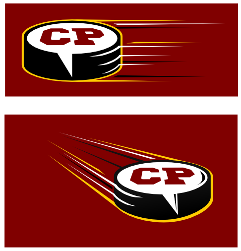
Allright, this is my final submission (please ignore all my previous ones)

Alternate version for the white background (note the white and red colors swapped)

Here's the transparent png in roughly the same size as the current logo ...
... and another one where CP is also transparent (so that the background gradient is seen through it)
As some people still prefer the original "right-to-left' version, here it is transparent and scaled down as well ...
Finally, both variants in use:
So that's it, that's the final one (need to stop before the threats of divorce start to come up)
Thanks for all the feedback!
Last edited by playmaker; 08-23-2014 at 02:22 PM.
|
|
|
|
|
The Following 10 Users Say Thank You to playmaker For This Useful Post:
|
|
|
08-23-2014, 02:38 PM
|
#604
|
|
Celebrated Square Root Day
|
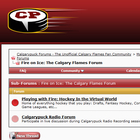
It is nice, but I'd be very surprised if Bingo went with it considering it isn't really what he seems to be looking for. He wanted a new logo, new look to go with the Flames heading into a new era.
Yours looks different from the current one, but it's literally the same idea. A puck, with CP in it and "speed lines". It may look slightly different, but the forum would have the exact same look and feel with your idea, imo.
|
|
|
|
|
08-23-2014, 02:53 PM
|
#605
|
|
Franchise Player
Join Date: Jul 2003
Location: Djibouti
|
Quote:
Originally Posted by Split98
Something I was sitting on for a week...
 |
For some reason, all I can see in drunken, wrinkled suit wearing Gary Busey giving the finger to onlookers
Edit: now that I think about it, that would be the perfect logo for the Off Topic section.
Last edited by Mike F; 08-23-2014 at 03:13 PM.
|
|
|
|
|
The Following 18 Users Say Thank You to Mike F For This Useful Post:
|
Burninator,
chalms04,
Coach,
Cole436,
Deegee,
flylock shox,
foshizzle11,
gonzo29,
Itse,
MarchHare,
normtwofinger,
Number 39,
OBCT,
Reign of Fire,
Split98,
Thor,
Titan,
Trailer Fire
|
|
08-23-2014, 02:54 PM
|
#606
|
|
First Line Centre
Join Date: Jul 2013
Location: Calgary
|
Quote:
Originally Posted by flameswin
It is nice, but I'd be very surprised if Bingo went with it considering it isn't really what he seems to be looking for. He wanted a new logo, new look to go with the Flames heading into a new era.
Yours looks different from the current one, but it's literally the same idea. A puck, with CP in it and "speed lines". It may look slightly different, but the forum would have the exact same look and feel with your idea, imo.
|
I always thought the speed lines you referred to in the current logo was a stick!
|
|
|
|
|
08-23-2014, 02:54 PM
|
#607
|
|
Franchise Player
Join Date: Aug 2007
Location: Ontario
|
Quote:
Originally Posted by Mike F
For some reason, all I can see in drunken, wrinkled suit wearing Gary Busey giving the finger to onlookers
|
Amazing.
|
|
|
|
|
08-24-2014, 11:03 AM
|
#608
|
|
Franchise Player
Join Date: Jun 2006
Location: Calgary, Alberta
|
Quote:
Originally Posted by shogged
I always thought the speed lines you referred to in the current logo was a stick!
|
I thought it was a stick as well.
|
|
|
|
|
The Following 2 Users Say Thank You to Joborule For This Useful Post:
|
|
|
08-25-2014, 06:22 PM
|
#609
|
|
Franchise Player
Join Date: Mar 2002
Location: Auckland, NZ
|
Was bored, so I decided to make a more linear version of my logo, now featuring text. I made two versions:
CHARCOAL

FLAMES COLORS

|
|
|
|
|
The Following 20 Users Say Thank You to Muta For This Useful Post:
|
Chill Cosby,
DownhillGoat,
Flame19,289,
Flames89,
jtfrogger,
KevanGuy,
Machiavelli,
Madman,
Mazrim,
MJK,
Mustache,
normtwofinger,
OBCT,
Ozy_Flame,
Pierre "Monster" McGuire,
RyZ,
shutout,
starseed,
Thor,
_Q_
|
|
08-25-2014, 06:29 PM
|
#610
|
|
Franchise Player
Join Date: Mar 2002
Location: Auckland, NZ
|
I also made a racing version, haha;

Last edited by Muta; 08-25-2014 at 06:35 PM.
|
|
|
|
|
The Following 5 Users Say Thank You to Muta For This Useful Post:
|
|
|
08-25-2014, 07:05 PM
|
#611
|
|
Self-Retirement
|
Quote:
Originally Posted by Split98
Something I was sitting on for a week...
|
Just change the text to forum.drunkpuck.com
|
|
|
|
|
08-25-2014, 07:54 PM
|
#612
|
|
NOT Chris Butler
|
Quote:
Originally Posted by flameswin
It is nice, but I'd be very surprised if Bingo went with it considering it isn't really what he seems to be looking for. He wanted a new logo, new look to go with the Flames heading into a new era.
Yours looks different from the current one, but it's literally the same idea. A puck, with CP in it and "speed lines". It may look slightly different, but the forum would have the exact same look and feel with your idea, imo.
|
In the current logo, the lines are supposed to be a blade of a stick I thought.
|
|
|
|
|
08-25-2014, 08:16 PM
|
#613
|
|
Franchise Player
|
I always felt that the puck on the current logo was nose-riding a skateboard. 
__________________
Quote:
Originally Posted by MisterJoji
Johnny eats garbage and isnt 100% committed.
|
|
|
|
|
|
The Following 2 Users Say Thank You to nik- For This Useful Post:
|
|
|
08-25-2014, 10:18 PM
|
#614
|
|
Not a casual user
Join Date: Mar 2006
Location: A simple man leading a complicated life....
|
__________________

Last edited by Dion; 08-25-2014 at 10:57 PM.
Reason: more added
|
|
|
|
|
The Following User Says Thank You to Dion For This Useful Post:
|
|
|
08-25-2014, 10:23 PM
|
#615
|
|
Franchise Player
Join Date: Aug 2004
Location: Conquering the world one 7-11 at a time
|
Quote:
Originally Posted by Muta
I also made a racing version, haha;
|
I actually like this a lot, especially if the point is to give the site a clean, modern look. Simple and to the point. Maybe play around with this in a couple different fonts - something like on the name bars on the back of the jerseys?
__________________
"There will be a short outage tonight sometime between 11:00PM and 1:00AM as network upgrades are performed. Please do not panic and overthrow society. Thank you."
|
|
|
|
|
08-25-2014, 10:49 PM
|
#616
|
|
Franchise Player
Join Date: Mar 2002
Location: Auckland, NZ
|
Quote:
Originally Posted by Redliner
I actually like this a lot, especially if the point is to give the site a clean, modern look. Simple and to the point. Maybe play around with this in a couple different fonts - something like on the name bars on the back of the jerseys?
|
Definitely, I can try that - does anyone know where I can find the Flames font?
|
|
|
|
|
08-26-2014, 08:38 AM
|
#617
|
|
First Line Centre
Join Date: Aug 2003
Location: Toronto, ON
|
I do like the idea of getting it down to a final 4 say, then maybe having the site use each one for a week.
We should start in a week or two, so the final decision can be put up for the first game of the season (Oct 8)
|
|
|
|
|
08-26-2014, 09:02 AM
|
#618
|
|
Franchise Player
Join Date: May 2004
Location: Helsinki, Finland
|
Quote:
Originally Posted by Muta
I also made a racing version, haha;
|
For me this is too "corporate". Which I guess just means that it's very sleek, minimal and professional looking, so not exactly your fault :P
|
|
|
|
|
08-26-2014, 09:08 AM
|
#619
|
|
#1 Goaltender
Join Date: Jan 2010
Location: Calgary
|
Quote:
Originally Posted by Muta
Was bored, so I decided to make a more linear version of my logo, now featuring text. I made two versions:
CHARCOAL
FLAMES COLORS
|
I am a big fan of both of these. What if you changed the colours to the CP red and black instead of the Flames colours?
|
|
|
|
|
The Following User Says Thank You to foshizzle11 For This Useful Post:
|
|
|
08-26-2014, 09:25 AM
|
#620
|
|
Franchise Player
|
Quote:
Originally Posted by foshizzle11
I am a big fan of both of these. What if you changed the colours to the CP red and black instead of the Flames colours?
|
IMO, the Flames colour one is great and adds the needed Flames flare to the modern design of Muta's logo.
|
|
|
|
 Posting Rules
|
You may not post new threads
You may not post replies
You may not post attachments
You may not edit your posts
HTML code is Off
|
|
|
All times are GMT -6. The time now is 09:19 AM.
|
|