 08-19-2014, 03:07 PM
|
#581
|
|
Franchise Player
Join Date: Aug 2007
Location: Ontario
|
Quote:
Originally Posted by playmaker

Man, I will spend my entire mid-30s doing this stuff ... But I feel I may be coming closer to my final (and the only) proposal so pls give me a few more days. This is the latest speech bubble puck experiment with the type of perspective that I originally used:

 |
COLOUR!
I love it. Not sold on it flying off the page, I kinda liked the puck flying into the page better and it would work better for other use cases as bingo mentioned.
But I love what you've done so far with the colour!
|

|

|
|
08-19-2014, 05:09 PM
|
#582
|
|
Franchise Player
Join Date: Feb 2007
Location: Calgary, AB
|
Quote:
Originally Posted by Bingo
Wow ... 30 pages, that's great guys.
The more I've seen these things the more I think there will either be two winners, or one winner with a two logo design (change of the master). I like some of the rectangular logos for the top of the site, but I prefer a more square/round logo as well for things like the twitter account.
Lots to choose from.
|
This post from Bingo got me thinking about a way we could have the rectangle and the round, while having one Calgarypuck brand.
Full credit goes to Split 98 for the design but though this is a good way to combine my personal favourite design with the rectangle skyline theme that a lot of people here like:


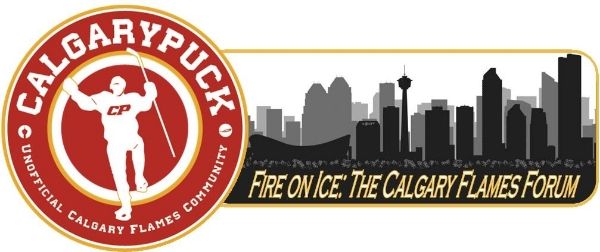
Have a main logo, with the rectangle skyline acting as a header telling you what sub-forum you are in.
You could do this with any of the round logos we have seen, just picked Split98s since it is my favourite.
Last edited by SuperMatt18; 08-19-2014 at 05:39 PM.
|
|
|
|
|
The Following 10 Users Say Thank You to SuperMatt18 For This Useful Post:
|
|
|
08-19-2014, 05:41 PM
|
#583
|
 Posted the 6 millionth post! |
Logo needs more iconic player outline. Use Theo fleury after his game winning playoff goal or have MacInnis winding up from the point.
|
|
|
|
|
08-19-2014, 05:51 PM
|
#584
|
|
Owner
Join Date: Dec 2001
Location: Calgary
|
Has anyone confirmed if you can even use a player outline?
|
|
|
|
|
08-19-2014, 06:23 PM
|
#585
|
|
The new goggles also do nothing.
Join Date: Oct 2001
Location: Calgary
|
Quote:
Originally Posted by Bingo
Has anyone confirmed if you can even use a player outline?
|
http://www.nhlpa.com/inside-nhlpa/bu...ensed-products
Likenesses of players has to be licensed. Does the silhouette of a player count as a likeness is the question I guess.
__________________
Uncertainty is an uncomfortable position.
But certainty is an absurd one.
|
|
|
|
|
08-19-2014, 06:33 PM
|
#586
|
|
tromboner
Join Date: Mar 2006
Location: where the lattes are
|
Quote:
Originally Posted by photon
|
I believe this is generally determined by whether or not the player is recognizable.
|
|
|
|
|
08-19-2014, 06:33 PM
|
#587
|
|
Franchise Player
Join Date: Nov 2003
Location: Calgary, AB
|
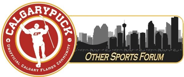
I'd recommend ditching the skyline in these logo pitches. They all look tacky as hell
|
|
|
|
|
The Following 2 Users Say Thank You to Tyler For This Useful Post:
|
|
|
08-19-2014, 06:36 PM
|
#588
|
Posted the 6 millionth post! |
Hard to say. Any lawyers on the board that can answer this? It is my understanding that you can use silhouettes if the logo and all trademarks are removed; but it comes down to the photo it was ripped from, who owns it, and whether the silhouette is recognizable enough to warrant copyright material. I suppose the graphic designer would have to disclose where the silhouette was borrowed from.
Maybe Bobby Orr's goal is iconic enough, but who knows about a Theo Fleury image or even a generic Al MacInnis wind-up shot.
My gut reaction is also that if the silhouette is taken from a non-copywrited image owned by a board member giving approval, it would likely fly (as long as all trademarks and copyright symbols are removed out of the image).
Any of the older CP'ers have some great high-quality images from yesteryear?
|
|
|
|
|
08-19-2014, 06:57 PM
|
#590
|
|
Franchise Player
|
Quote:
Originally Posted by photon
|
I wonder if anyone would even recognize that was Monahan except for us nerds.
Quote:
Originally Posted by Bingo
Wow ... 30 pages, that's great guys.
The more I've seen these things the more I think there will either be two winners, or one winner with a two logo design (change of the master). I like some of the rectangular logos for the top of the site, but I prefer a more square/round logo as well for things like the twitter account.
Lots to choose from.
|
It's kind of you to make people feel good about this when it's obvious I clinched this like 10 posts in.
__________________
Quote:
Originally Posted by MisterJoji
Johnny eats garbage and isnt 100% committed.
|
|
|
|
|
|
08-19-2014, 06:59 PM
|
#591
|
|
Lifetime Suspension
|
As I've said, it looks a bit like a cross country skier with one ski pole. Not a fan of the idea.
|
|
|
|
|
08-19-2014, 07:01 PM
|
#592
|
|
Franchise Player
|
yeah, I'd prefer the Backlund knee pump celebration as the outline ... but I can't make any of those things, so who cares 
__________________
Quote:
Originally Posted by MisterJoji
Johnny eats garbage and isnt 100% committed.
|
|
|
|
|
|
08-19-2014, 08:54 PM
|
#593
|
|
The new goggles also do nothing.
Join Date: Oct 2001
Location: Calgary
|
Quote:
Originally Posted by Ozy_Flame
but it comes down to the photo it was ripped from, who owns it, and whether the silhouette is recognizable enough to warrant copyright material.
|
I posted a link to the original somewhere earlier in the thread, it's from a sports photographer from (or through?) Getty.
Recognizable, yeah I might agree with nik-, the # of people recognizing the silhouette on sight is probably limited to us.
__________________
Uncertainty is an uncomfortable position.
But certainty is an absurd one.
|
|
|
|
|
08-19-2014, 10:22 PM
|
#594
|
|
Lifetime Suspension
|
My vote would be for the puck/bubble idea above. No issues involving players or landmarks. Keeps with the CP puck tradition, but with an interesting visual update. Maintains the colour scheme so little else on the page needs to be changed.
However, I'd like to contribute my other ideas before all is said and done. Kicking myself cause I haven't had time. Will play around with my flaming puck logo too, I know some liked where that was going. But keep it going at least until the months end, please. 
|
|
|
|
|
08-19-2014, 11:25 PM
|
#595
|
|
Franchise Player
Join Date: Aug 2007
Location: Ontario
|
In all fairness, people thought it was a generic player pose until I pointed out it was Monahan... so... 
But honestly, I haven't been able to find a solid answer on this one way or the other. In the past me and companies I've worked with have used source images to build imagery and no one actually brought up this concept once. Not saying we've always been doing the right thing, but it is frequently done. Maybe it's frequently done because it's perfectly fine?  I don't know!
|
|
|
|
|
08-20-2014, 12:44 AM
|
#596
|
|
Not a casual user
Join Date: Mar 2006
Location: A simple man leading a complicated life....
|
__________________

Last edited by Dion; 08-20-2014 at 01:05 AM.
|
|
|
|
|
The Following 2 Users Say Thank You to Dion For This Useful Post:
|
|
|
08-20-2014, 03:10 PM
|
#597
|
|
Scoring Winger
Join Date: Jul 2011
Location: at home
|
Quote:
Originally Posted by Split98
COLOUR!
I love it. Not sold on it flying off the page, I kinda liked the puck flying into the page better and it would work better for other use cases as bingo mentioned.
But I love what you've done so far with the colour!
|
Well, that could work too but I found it difficult to align it with the content frame. The other way around would be to let the puck flying from top left corner as shown below. This would have an advantage of resembling the current logo (which may be a desired feature for some people)
I also think that it will look better when the yellow outline is not around the entire puck (again the resemblance to the current logo)
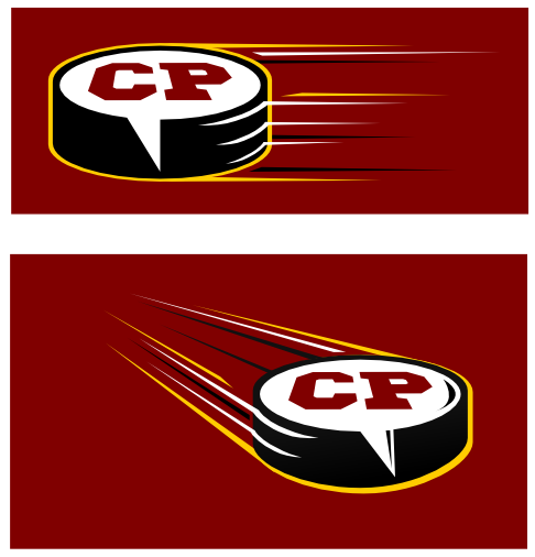
Some details (shades, reflections, etc.) still need to be polished though.
|
|
|
|
|
The Following 7 Users Say Thank You to playmaker For This Useful Post:
|
|
|
08-20-2014, 03:12 PM
|
#598
|
|
Franchise Player
Join Date: Aug 2007
Location: Ontario
|
Well done, I really like that.
|
|
|
|
|
08-20-2014, 03:29 PM
|
#599
|
|
Franchise Player
Join Date: Mar 2002
Location: Auckland, NZ
|
I like it, but my only concern with that one is it looks similar in shape and feel to the current one. The understanding I have of Bingo's original post for the purpose of this contest, there is a 'new team, new look'. The same goes for the redesign of the logo, and possibly the site. Nevertheless, well done.
|
|
|
|
|
The Following User Says Thank You to Muta For This Useful Post:
|
|
|
08-23-2014, 08:00 AM
|
#600
|
|
ALL ABOARD!
|
Quote:
Originally Posted by playmaker
|
In my opinion, this is easily the best of the bunch.
The skylines and player outlines are just cheesy. Most of them will also look muddled when they're stuck at the top of the forum.
If Bingo and the rest of the CP crew decided to make some merchandise, playmaker's would look great on a hat or a t-shirt.
Last edited by KTrain; 08-26-2014 at 07:25 AM.
|
|
|
|
|
The Following User Says Thank You to KTrain For This Useful Post:
|
|
 Posting Rules
|
You may not post new threads
You may not post replies
You may not post attachments
You may not edit your posts
HTML code is Off
|
|
|
All times are GMT -6. The time now is 12:25 AM.
|
|


