 11-28-2014, 12:15 AM
|
#1
|
|
First Line Centre
Join Date: Jan 2011
Location: Fort St. John, BC
|
 Canucks test green jersey
Quote:
|
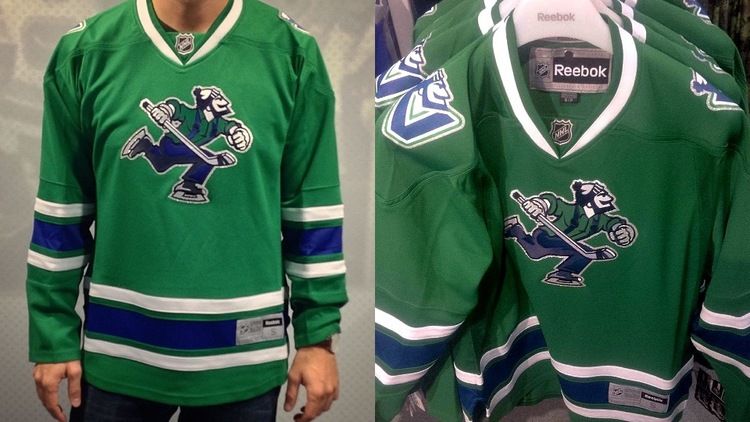
The Vancouver Canucks made waves by introducing an eye-catching new product to their team store this week a green fashion jersey featuring a Johnny Canuck crest.
|
http://www.icethetics.co/blog/2014/1...fashion-jersey
Another colour added to the sea of blue, yellow, black, red, maroon and burgundy...
|

|

|
|
The Following User Says Thank You to doctajones428 For This Useful Post:
|
|
|
11-28-2014, 12:18 AM
|
#2
|
|
Lifetime Suspension
|
What a mess.
|
|
|
|
|
11-28-2014, 12:19 AM
|
#3
|
|
Franchise Player
|
That looks like a wal-mart jersey.
__________________

|
|
|
|
|
The Following 4 Users Say Thank You to corporatejay For This Useful Post:
|
|
|
11-28-2014, 12:19 AM
|
#4
|
|
Powerplay Quarterback
Join Date: Jul 2009
Location: H E double hockey sticks
|
Swing and a miss...
|
|
|
|
|
The Following 3 Users Say Thank You to Bezer For This Useful Post:
|
|
|
11-28-2014, 12:22 AM
|
#5
|
|
Powerplay Quarterback
Join Date: Oct 2009
Location: Around the world
|
The jersey looks like a leprechaun threw up on it.
On the bright side, they'll probably sell well on St. Patrick's day.
|
|
|
|
|
The Following User Says Thank You to mister__big For This Useful Post:
|
|
|
11-28-2014, 12:24 AM
|
#6
|
|
Not a casual user
Join Date: Mar 2006
Location: A simple man leading a complicated life....
|
Looks like an ugly Christmas sweater
__________________

|
|
|
|
|
11-28-2014, 12:27 AM
|
#7
|
|
Powerplay Quarterback
Join Date: Dec 2010
Location: Calgary
|
Some times I can't help but think that Vancouver's jersey designers (for "fashion" or real jerseys) are running a decades long practical joke.
|
|
|
|
|
The Following 14 Users Say Thank You to TBone290 For This Useful Post:
|
BigT112,
Boreal,
Buzzard,
CalgaryFan1988,
endeavor,
Funkhouser,
MarchHare,
mrkajz44,
Mustache,
Pierre "Monster" McGuire,
Regulator75,
terminator,
The Hendog,
Thor
|
|
11-28-2014, 12:43 AM
|
#9
|
|
Backup Goalie
Join Date: Mar 2010
Location: Seattle
Exp: 
|
I think a green version of their current would have been better, but I have to give them some credit for listening to their fans.
Fans have been saying a green jersey since they switched to the blue, white, greens
|
|
|
|
|
11-28-2014, 12:46 AM
|
#11
|
|
Lifetime Suspension
|
The Hartford Whalers called... they want their jerseys back.
|
|
|
|
|
The Following 2 Users Say Thank You to GoJetsGo For This Useful Post:
|
|
|
11-28-2014, 12:47 AM
|
#12
|
|
UnModerator
Join Date: Dec 2004
Location: North Vancouver, British Columbia.
|
Pass.
__________________

THANK MR DEMKOCPHL Ottawa Vancouver
|
|
|
|
|
11-28-2014, 12:49 AM
|
#13
|
|
First Line Centre
|
Quote:
Originally Posted by TBone290

|
Sorry I'm confused should they stick to one colour scheme or logo? It's like the organization has a personality disorder. How long until they bring back the Orange & Black. JAY-SUS!
|
|
|
|
|
11-28-2014, 12:50 AM
|
#14
|
|
Franchise Player
Join Date: Nov 2009
Location: Kelowna, BC
|
just one more thing about them that is no good!
__________________
"...and there goes Finger up the middle on Luongo!" - Jim Hughson, Av's vs. 'Nucks
|
|
|
|
|
11-28-2014, 05:18 AM
|
#15
|
|
Franchise Player
Join Date: Jun 2009
Location: Thunder Bay Ontario
|
"Johnny cannuck"? Does that mean the wearer of that jersey will be just like Johnny Hockey, just a lot more like a ¥€%# bag?
__________________
Fan of the Flames, where being OK has become OK.
|
|
|
|
|
11-28-2014, 05:25 AM
|
#16
|
|
Franchise Player
Join Date: Mar 2004
Location: Chilliwack, B.C
|
At least it doesnt have that stupid VANCOUVER word on it
|
|
|
|
|
The Following 2 Users Say Thank You to calgaryred For This Useful Post:
|
|
|
11-28-2014, 05:27 AM
|
#17
|
|
Franchise Player
|
If there's one thing the Canucks know how to do one thing, it's squeeze their fans for more jersey money.
|
|
|
|
|
11-28-2014, 06:59 AM
|
#18
|
|
Crash and Bang Winger
|
What are they testing?
|
|
|
|
|
11-28-2014, 07:01 AM
|
#19
|
|
Powerplay Quarterback
|
Well I despise the Canucks but I have no problem with them using the Johnny Canuck motif. The pre NHL Canucks used the lumberjack symbol right through the sixties. I like tie ins to earlier teams and at least this one is real. Besides, he looks like Black Jack Shellac.
|
|
|
|
|
11-28-2014, 07:04 AM
|
#20
|
|
Franchise Player
|
the johnny cancuk logo seems to high. Its almost like originally they had Vancouver below but ended up ditching it and forgetting to center the logo.
|

|
|
|
The Following 9 Users Say Thank You to Robbob For This Useful Post:
|
|
 Posting Rules
|
You may not post new threads
You may not post replies
You may not post attachments
You may not edit your posts
HTML code is Off
|
|
|
All times are GMT -6. The time now is 03:41 PM.
|
|


