07-29-2014, 10:58 AM
|
#61
|
|
First Line Centre
Join Date: Oct 2011
Location: The Armpit of BC: Trail
|
Quote:
Originally Posted by the_only_turek_fan

^ That Coyotes jersey is among the worst in NHL history.
|
False. That Coyotes jersey is amazing.
__________________
Disregard any and all THANKS I give. I'm a dirty, dirty thanks-whore.
|

|

|
|
The Following 3 Users Say Thank You to Trailer Fire For This Useful Post:
|
|
|
07-29-2014, 11:01 AM
|
#62
|
|
Franchise Player
Join Date: Feb 2009
Location: Abbotsford, BC
|
Quote:
Originally Posted by getbak
Yup. Here's Kesler modeling the new whites too...

On the preview image, and the jerseys they gave out at the draft, the border around the numbers is orange, so the lettering on Kesler's jersey is probably leftover gold border stock from last season. |
Ryan Kesler needs to shave his neck. That's gross.
|
|
|
|
|
The Following User Says Thank You to Pierre "Monster" McGuire For This Useful Post:
|
|
|
07-29-2014, 11:01 AM
|
#63
|
|
Franchise Player
|
That Coyotes jersey looks like a really bad ECHL jersey.
__________________
Quote:
Originally Posted by CroFlames
Before you call me a pessimist or a downer, the Flames made me this way. Blame them.
|
|
|
|
|
|
07-29-2014, 11:15 AM
|
#64
|
|
Powerplay Quarterback
|
Quote:
Originally Posted by Pierre "Monster" McGuire
Ryan Kesler needs to shave his neck. That's gross.
|
Burrows used to do it for him on "Pad Thai Tuesdays", but he can't any more since they're on different teams.
|
|
|
|
|
The Following User Says Thank You to DionTheDman For This Useful Post:
|
|
|
07-29-2014, 11:16 AM
|
#65
|
|
#1 Goaltender
|
Quote:
Originally Posted by codynw
That Coyotes jersey looks like a really bad ECHL jersey.
|
Not true. That jersey has character and is awesome
|
|
|
|
|
07-29-2014, 11:44 AM
|
#66
|
|
Lifetime Suspension
|
Quote:
Originally Posted by Bingo
I just can't for the life of me understand why this hasn't already been done. Love it.
|
Because it's already been done?
Except for the shoulder patches it's already done the rounds. As much as we all love the retros, they're not going to revive it just to add a shoulder patch. It's time we start looking at something new and different. Something we haven't seen just with slight alterations. But something that can still looks like a classic jersey. Obviously the new thirds were a complete flop on the design side of things, but there are plenty of good, new ideas that came up in the Ken King thread.
|
|
|
|
|
07-29-2014, 11:48 AM
|
#67
|
|
Franchise Player
|
I think the retros should be the permanent home/away jerseys. I know it's been beat to death, but those jerseys are fantastic.
__________________
Quote:
Originally Posted by CroFlames
Before you call me a pessimist or a downer, the Flames made me this way. Blame them.
|
|
|
|
|
|
The Following 3 Users Say Thank You to codynw For This Useful Post:
|
|
|
07-29-2014, 12:24 PM
|
#68
|
|
Lifetime Suspension
|
Quote:
Originally Posted by Obsidian
Modified those for a Flames version:

Looked a bit off at first, but I'm really coming around to it! Maybe I'll do the aways too. |
Modification to your modification.. or just me screwing around.

Black patches don't work too well, but i kept the striping and just added a whole lot of yellow instead.
|
|
|
|
|
The Following 3 Users Say Thank You to djsFlames For This Useful Post:
|
|
|
07-29-2014, 12:59 PM
|
#69
|
|
Lifetime Suspension
|
Quote:
Originally Posted by playmaker
here's my concept from the 'Ken King please read' thread
|
Perfection - wake up Flames and get these going!
|
|
|
|
|
07-29-2014, 04:01 PM
|
#70
|
|
Franchise Player
Join Date: Sep 2013
Location: Brisbane
|

A few jersey comments:
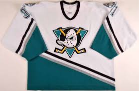
The Ducks jerseys are no longer worst in the league but I'm still not a fan of them. It still seems like they couldn't decide to copy the colours of Philly or Pittsburgh so they just took both. The Ducks need to go back to teal and eggplant since it was original and the white versions were one of the best in the league. I would also accept them going all orange like the winter classic to fully embrace Orange County and at least that only copies Philly's colours.
Those old Phoenix uniforms were hideous and I am not sure why they would bring them back even for one game. The Coyotes made a great decision switching from those very busy multi-coloured jerseys and going with a simple two colour look. I guess they still look good compared to this and most other third jerseys at the time.

That's awesome the Hitmen are bring back the Brett Hart coloured uniforms again. At the time they were the most original jerseys in all of hockey, it's just too bad they couldn't use the great logo initially. The copper also looks good but there would have been no problem if they had never changed.
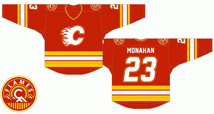
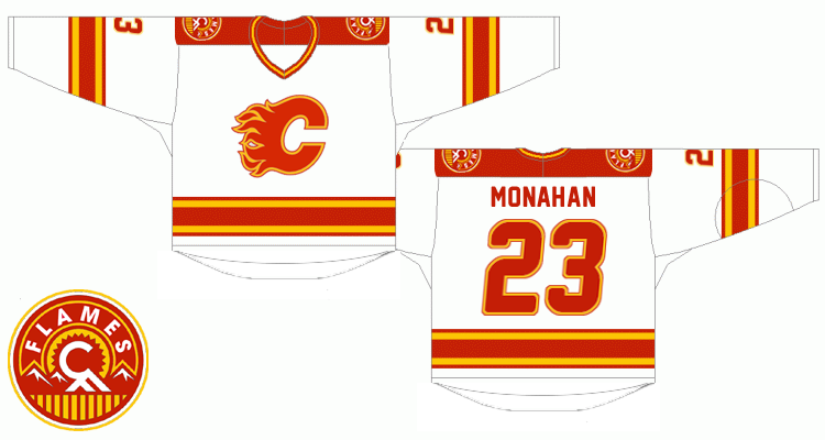
Finally, like others I am really hoping the get rid of all three current Flames jerseys and approve of the modernized classic look above. I would be happy if a new Flames jersey had the following: No vertical striping or 45 degree can't make up your mind pedestal striping . No horse heads or flags on the shoulders, either go with nothing or the new secondary logo. Mainly Red and Yellow. I would only accept a small amount of black as an outline or small stripes. I could also handle them still wearing black pants since Team Canada has shown they can look fine when paired with a mostly red jersey.
|
|
|
|
|
07-29-2014, 07:20 PM
|
#71
|
|
Franchise Player
Join Date: Sep 2012
Location: SW Calgary
|
Anybody posted these yet? Not sure how I feel about the third but like the home/away.
http://hfboards.hockeysfuture.com/sh....php?t=1713961
|
|
|
|
|
The Following 2 Users Say Thank You to btimbit For This Useful Post:
|
|
|
07-29-2014, 10:17 PM
|
#72
|
|
Franchise Player
Join Date: Jul 2010
Location: Calgary - Centre West
|
Aside from the fact that we won the Cup in '89 with a similar color scheme, I will never understand the love this forum has for that orangey-red. Your Calgary Flames - color by Technicolor. 
Give me the red from the 03-04 jerseys any day.
__________________
-James
GO FLAMES GO.
|
|
|
|
|
The Following 3 Users Say Thank You to TorqueDog For This Useful Post:
|
|
|
07-29-2014, 10:25 PM
|
#73
|
|
#1 Goaltender
|
Quote:
Originally Posted by TorqueDog
Aside from the fact that we won the Cup in '89 with a similar color scheme, I will never understand the love this forum has for that orangey-red. Your Calgary Flames - color by Technicolor.
Give me the red from the 03-04 jerseys any day. |
Hate to be "that guy" but the reds are exactly the same. They just appear different when paired with white, black and yellow as opposed to just white and yellow.
|
|
|
|
|
07-29-2014, 10:39 PM
|
#74
|
|
Franchise Player
Join Date: Feb 2006
Location: Calgary, AB
|
Quote:
Originally Posted by bax
Hate to be "that guy" but the reds are exactly the same. They just appear different when paired with white, black and yellow as opposed to just white and yellow.
|
Yup. Here's photographic proof...
Quote:
Originally Posted by getbak
4 authentic jerseys side by side:

The bottom one is the current normal home jersey; on top of that is the retro jersey they wore in 09-10; on top of that is the pre-Edge home jersey with the horse heads on the shoulders; on top of that is the new third. |
__________________
Turn up the good, turn down the suck!
|
|
|
|
|
The Following 14 Users Say Thank You to getbak For This Useful Post:
|
-TC-,
bax,
chalms04,
Cheese,
DaQwiz,
driveway,
Finger Cookin,
Gallick,
Itse,
jayswin,
Nehkara,
saskflames69,
tripin_billie,
troutman
|
|
07-29-2014, 11:24 PM
|
#75
|
|
Lifetime Suspension
|
Anaheim's jerseys remind me of the Price is Right.

The black ones are the worst in the league. Even worse than Buffalo's two-sided abomination.
|
|
|
|
|
The Following 7 Users Say Thank You to Magnum PEI For This Useful Post:
|
|
|
07-30-2014, 01:09 PM
|
#76
|
|
Franchise Player
Join Date: Feb 2006
Location: Calgary
|
Quote:
Originally Posted by bax
Hate to be "that guy" but the reds are exactly the same. They just appear different when paired with white, black and yellow as opposed to just white and yellow.
|
Blew my mind the first time I found out too, but that's all the more reason to put some black into the home jersey. I just do not like the red, orangy yellow, and white. It makes the whole jersey look orangy-red. Having some black in the jersey makes it seem like a much nicer red. It looks ok on the away jersey since white is predominate colour, which cuts down on the whole Ronald MacDonald colour scheme.
|
|
|
|
|
07-30-2014, 01:25 PM
|
#77
|
|
Owner
Join Date: Dec 2001
Location: Calgary
|
Quote:
Originally Posted by djsFlames
Because it's already been done?
Except for the shoulder patches it's already done the rounds. As much as we all love the retros, they're not going to revive it just to add a shoulder patch. It's time we start looking at something new and different. Something we haven't seen just with slight alterations. But something that can still looks like a classic jersey. Obviously the new thirds were a complete flop on the design side of things, but there are plenty of good, new ideas that came up in the Ken King thread.
|
I think it's already been done is my whole point? Go back to it. If you have to change it at all I'm ok with a small change or a shoulder patch, but go back to what the Flames always should have been.
Red/Gold/White ... no black, no vertical striping, no crazy slanted podium, no horse head.
Clearly all just my opinion, and I get that others like new and change, but I love the old Bruins jerseys, I'm glad Edmonton is back to the 80s look, would love to see the Jets bring back their old logo ... heck I love the old Kings purple jerseys. Only exception is the Canucks, I'm glad they went further back to the hockey stick, because the 80s were a mess for them.
|

|
|
|
The Following 9 Users Say Thank You to Bingo For This Useful Post:
|
|
|
07-30-2014, 01:52 PM
|
#78
|
|
Franchise Player
Join Date: Aug 2007
Location: Vancouver
|
Quote:
Originally Posted by Bingo
I think it's already been done is my whole point? Go back to it. If you have to change it at all I'm ok with a small change or a shoulder patch, but go back to what the Flames always should have been.
Red/Gold/White ... no black, no vertical striping, no crazy slanted podium, no horse head.
Clearly all just my opinion, and I get that others like new and change, but I love the old Bruins jerseys, I'm glad Edmonton is back to the 80s look, would love to see the Jets bring back their old logo ... heck I love the old Kings purple jerseys. Only exception is the Canucks, I'm glad they went further back to the hockey stick, because the 80s were a mess for them.
|
Couldn't agree more. If you did a list of best pro sports jerseys/logos, the top ones are all pretty much guaranteed to have few or no changes to their jerseys since the beginning. Because they were great the first time.
It's like telling the Stones to stop using the lips because they've done it before. Well yeah, it's their logo and colors. It's kind of their thing.
It's why I like the cream ones from Split98. They are something different while also keeping in tune with the originals. And they look super classy. Plus the calgary tower patch, or the little flame on the shape of the province, or just the little flame on the cuff are all nice, unique possible additions.
__________________

Last edited by Coach; 07-30-2014 at 01:55 PM.
|
|
|
|
|
07-30-2014, 08:57 PM
|
#79
|
|
Franchise Player
Join Date: Dec 2011
Location: Calgary
|
I want the best of both worlds. I want to see a new design with the retro colours. Something modern but that still has a classic feel to it.
|
|
|
|
|
07-30-2014, 09:09 PM
|
#80
|
|
Franchise Player
Join Date: Jan 2013
Location: Cape Breton Island
|
I'd like to see the Jets introduce their 3rd jerseys as the 80's or 90's jerseys and then over a few years have them take over. Or maybe update the colours. It's funny I like the jerseys but dont love them, yet people I talk to in everyday hockey chat around work and and elsewhere are really big fans of the new Jets jerseys.
|
|
|
|
 Posting Rules
|
You may not post new threads
You may not post replies
You may not post attachments
You may not edit your posts
HTML code is Off
|
|
|
All times are GMT -6. The time now is 10:39 AM.
|
|