|
View Poll Results: Where would you like the Flames to go with their jerseys?
|
|
Keep with the existing set
|
   
|
9 |
2.34% |
|
go back to vintage home and away
|
  
|
229 |
59.48% |
|
go back to 2004 home and away
|
  
|
26 |
6.75% |
|
minor tweak to the existing set (piping, flags)
|
  
|
40 |
10.39% |
|
new design that adds black to the retro look
|
  
|
36 |
9.35% |
|
completely new design
|
  
|
39 |
10.13% |
|
other (elaborate)
|
|
6 |
1.56% |
 06-16-2017, 08:18 PM
|
#441
|
|
Scoring Winger
|
Quote:
Originally Posted by t0rrent98

I went with the 04 set because I doubt Ken King and Co. are going to go back to the Vintage jerseys as much as I'd like them too.
|
So, in other words, you didn't answer the question properly?
|

|
|
|
The Following 3 Users Say Thank You to MacFlame For This Useful Post:
|
|
|
06-16-2017, 08:41 PM
|
#442
|
|
Crash and Bang Winger
Join Date: May 2009
Location: Calgary
|
Quote:
Originally Posted by frodo_t_baggins
What a strange way of interpreting the poll. Firstly, 58% is a very strong majority, especially in a poll with several different options. Next, lumping all the other categories together doesn't represent anything as there can only be one jersey. You can't interpret this as 42% of people would be happy with a jersey other than the retro. If the next most popular jersey was selected, only 11% of people would be getting their first choice. If you remove all the other options as a primary choice and just kept the top 2; ~85% of votes went to the retro which is huge. You can say that CP is a small sample size, but to say any other one jersey would satisfy close to as many fans as the retros would based on this poll is completely false.
|
What a strange way of interpreting what my interpretation actually was. Perhaps you should go back and read what I wrote again. You are saying that I said things that I didn't say.
__________________
The Doctor is in
|
|
|
|
|
The Following User Says Thank You to Dr. Pepper For This Useful Post:
|
|
|
06-16-2017, 09:43 PM
|
#443
|
|
Farm Team Player
Join Date: Jun 2016
Exp: 
|
Id like them to go retro but if not something new and no matter what it must have red helmets to match the red jersey. That's part or what makes the retros so good is the brightness of the red jersey and the shiny red helmets to match
|
|
|
|
|
The Following 2 Users Say Thank You to dabrit For This Useful Post:
|
|
|
06-16-2017, 09:45 PM
|
#444
|
|
Powerplay Quarterback
|
 New Flames Uniforms for 2017-2018 due to be revealed June 20th
Quote:
Originally Posted by dabrit
Id like them to go retro but if not something new and no matter what it must have red helmets to match the red jersey. That's part or what makes the retros so good is the brightness of the red and the shiny red helmets to match
|
There's a 4.7 percent chance of the helmets being red.
I'm on the "ok with black" wagon. I like the black C, and think the current jersey would be pretty good with less random piping and with the alternate patch instead of the flags.
__________________
Is your cat doing singing?
Last edited by Max Cow Disease; 06-16-2017 at 09:50 PM.
|
|
|
|
|
The Following User Says Thank You to Max Cow Disease For This Useful Post:
|
|
|
06-17-2017, 11:09 AM
|
#445
|
|
Scoring Winger
|
Quote:
Originally Posted by Geeoff
Even the horse head is better than the flags.
|
Horsehead was a decent jersey that gets too much hate, much like the pedestal (likely because both jerseys were from an era where the team struggled mightily). Both of those are much better than having a black/burnt C and shoulder flags.
|
|
|
|
|
06-17-2017, 11:28 AM
|
#446
|
|
Scoring Winger
Join Date: Jul 2011
Location: at home
|
Apart from contrast issues which I mentioned a lot of times in 'KK please read' thread, there's a fundamental problem with the black flaming C. Black is the color of something that's burnt therefore every flaming logo in black simply loses its impact.
As for the contrast, sometimes a picture is worth a thousand words so this is what, in my opinion Flames are doing to their logo:
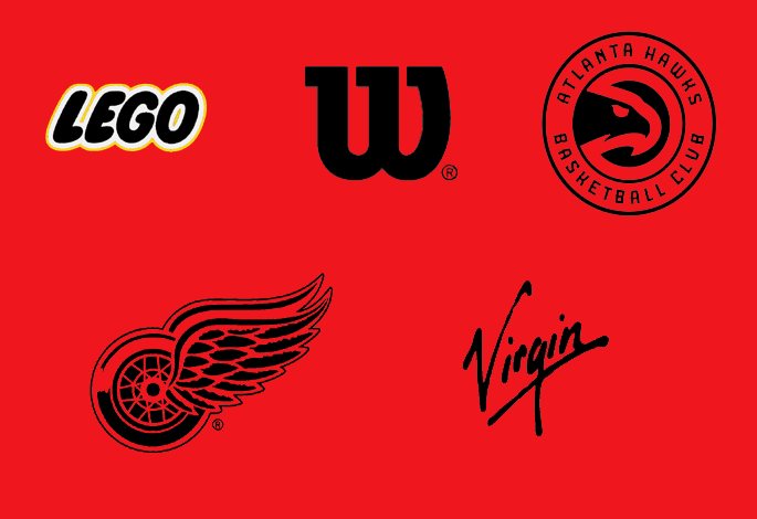
Back to normal:
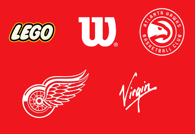
You'll never achieve the same contrast and impact with a black logo on red, even if its shape is perfect.
The interesting thing here is Lego comparison as in black it suffers from the same blending issue as the black flaming C. Clearly, the effect of double outline is lost as white and yellow blend together in small scale (or seen from a distance).
|
|
|
|
|
The Following 41 Users Say Thank You to playmaker For This Useful Post:
|
Allos,
bc-chris,
btimbit,
ComixZone,
DaQwiz,
Domoic,
drewtastic,
foofighter15,
GoFlamesGo,
handgroen,
Hockey Fan #751,
hurtin_albertan,
icecube,
iggypop,
Itse,
Jay Random,
Jetfire,
Joborule,
JohnnyB,
KevanGuy,
Kolbe31,
Lanny_McDonald,
Mazrim,
normtwofinger,
OBCT,
Phaneuf,
Reign of Fire,
Robo,
Rubicant,
Samonadreau,
sun,
Swayze11,
Textcritic,
TheFlamesVan,
TheScorpion,
the_only_turek_fan,
topfiverecords,
tripin_billie,
united,
Zarley,
_Q_
|
|
06-17-2017, 01:16 PM
|
#447
|
|
Scoring Winger
|
Quote:
Originally Posted by playmaker
Apart from contrast issues which I mentioned a lot of times in 'KK please read' thread, there's a fundamental problem with the black flaming C. Black is the color of something that's burnt therefore every flaming logo in black simply loses its impact.
As for the contrast, sometimes a picture is worth a thousand words so this is what, in my opinion Flames are doing to their logo:
Back to normal:
You'll never achieve the same contrast and impact with a black logo on red, even if its shape is perfect.
The interesting thing here is Lego comparison as in black it suffers from the same blending issue as the black flaming C. Clearly, the effect of double outline is lost as white and yellow blend together in small scale (or seen from a distance). |
Excellent post!
|
|
|
|
|
The Following 3 Users Say Thank You to Young_Guns For This Useful Post:
|
|
|
06-17-2017, 03:51 PM
|
#448
|
|
Scoring Winger
|
|
|
|
|
|
The Following User Says Thank You to Playfair For This Useful Post:
|
|
|
06-17-2017, 05:27 PM
|
#449
|
|
Franchise Player
Join Date: Mar 2004
Location: 161 St. - Yankee Stadium
|
Quote:
Originally Posted by Playfair
|
I would LOL
|
|
|
|
|
The Following User Says Thank You to JBR For This Useful Post:
|
|
|
06-17-2017, 05:46 PM
|
#450
|
|
Franchise Player
Join Date: Mar 2006
Location: Shanghai
|
That's not a nice looking jersey. What's different from what they have now?
__________________
"If stupidity got us into this mess, then why can't it get us out?"
|
|
|
|
|
06-17-2017, 07:00 PM
|
#451
|
|
Franchise Player
Join Date: Feb 2006
Location: Calgary, AB
|
Quote:
Originally Posted by JohnnyB
That's not a nice looking jersey. What's different from what they have now?
|
The thick-ass white collar is the most-obvious difference.
Last season's orange jersey had a thicker blue line and no separation between the white and blue lines. They also had the numbers on the shoulders last year.
__________________
Turn up the good, turn down the suck!
|
|
|
|
|
The Following 2 Users Say Thank You to getbak For This Useful Post:
|
|
|
06-18-2017, 06:52 AM
|
#452
|
|
#1 Goaltender
Join Date: Aug 2007
Location: EASHL Locker Room
|
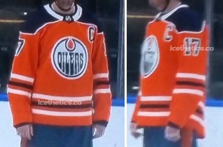
This doesn't have a white collar on it
Hopefully putting an end to this Oilers talk...
Last edited by foofighter15; 06-18-2017 at 06:54 AM.
|
|
|
|
|
The Following User Says Thank You to foofighter15 For This Useful Post:
|
|
|
06-18-2017, 09:49 AM
|
#453
|
|
Scoring Winger
|
Quote:
Originally Posted by JBR
I would LOL
|
Until you saw the Flames if this is what addidas thinks looks good. I'm hoping it s fake otherwise jerseys are really going to suck this year.
|
|
|
|
|
06-18-2017, 11:09 AM
|
#454
|
|
First Line Centre
Join Date: Oct 2009
Location: Calgary
|
Quote:
Originally Posted by foofighter15
This doesn't have a white collar on it
Hopefully putting an end to this Oilers talk... |
It could be white only on the front half...
|
|
|
|
|
The Following 3 Users Say Thank You to RM14 For This Useful Post:
|
|
|
06-18-2017, 11:28 AM
|
#455
|
|
Taking a while to get to 5000
|
There is way too much blue down the back of the jersey in the "leaked" photo in comparison to the teaser from Adidas. The Adidas teaser looks like, maybe a few inches from the top of the collar to just under the Adidas logo.
|
|
|
|
|
06-18-2017, 11:59 AM
|
#456
|
|
Lifetime Suspension
|
Quote:
Originally Posted by Playfair
|
gross if so
|
|
|
|
|
The Following 2 Users Say Thank You to Love For This Useful Post:
|
|
|
06-18-2017, 12:01 PM
|
#457
|
|
Franchise Player
Join Date: Dec 2005
Location: back in the 403
|
I don't get why they'd go back to navy, the regular blue looks a lot better. That jersey was already ugly, now it's even worse
|
|
|
|
|
The Following User Says Thank You to Sainters7 For This Useful Post:
|
|
|
06-18-2017, 07:08 PM
|
#458
|
|
First Line Centre
Join Date: Oct 2008
Location: Cambodia
|
Quote:
Originally Posted by Love
gross if so
|
The white collar is awful and I don't love the white piping around the shoulders, but I think the rest of it would look ok (other than having a strike against it for being an Oilers jersey) if the person wearing it had shoulders.
|
|
|
|
|
06-18-2017, 07:11 PM
|
#459
|
|
Franchise Player
Join Date: Aug 2007
Location: Vancouver
|
Can we get those gross Oilers rags out of this thread?
__________________

|
|
|
|
|
The Following 19 Users Say Thank You to Coach For This Useful Post:
|
bc-chris,
Dr. Pepper,
drewtastic,
FireGilbert,
heep223,
Iveman,
jayswin,
Max Cow Disease,
Mony,
N-E-B,
normtwofinger,
Pellanor,
PepsiFree,
Robbob,
SmoggyFlamesFan,
Snuffleupagus,
Sutter_in_law,
TheScorpion,
Tyler
|
|
06-18-2017, 11:47 PM
|
#460
|
|
First Line Centre
Join Date: Jan 2010
Location: So Long, Bannatyne
|
Quote:
Originally Posted by MattyC
Can we get those gross Oilers rags out of this thread?
|
Agreed.
With that in mind (and for those of us on Tapatalk), here's one of my favourite photos of all time, which I hope will act as a replacement image until we get some actual Flames unis updates.

|
|
|
|
|
The Following 7 Users Say Thank You to drewtastic For This Useful Post:
|
|
 Posting Rules
|
You may not post new threads
You may not post replies
You may not post attachments
You may not edit your posts
HTML code is Off
|
|
|
All times are GMT -6. The time now is 05:39 AM.
|
|