 07-30-2014, 09:28 PM
|
#81
|
|
Franchise Player
Join Date: Jul 2005
Location: SW Ontario
|
Quote:
Originally Posted by Bingo

I just can't for the life of me understand why this hasn't already been done. Love it.
|
Because they look too much like the retro's and those need to be left in the past. The black with the red looks sharp, it needs to be there.
|

|

|
|
07-30-2014, 09:45 PM
|
#82
|
|
Franchise Player
Join Date: Feb 2006
Location: Calgary, AB
|

Quote:
Originally Posted by N-E-B
I want the best of both worlds. I want to see a new design with the retro colours. Something modern but that still has a classic feel to it.
|
That's what I want.
It's interesting that Bingo mentions the "old Bruins" jerseys because they actually made some significant changes to their look with the Edge re-design.
You can look at their historical uniforms here: http://nhluniforms.com/Bruins/Bruins.html
Their current jerseys were obviously inspired by the Orr-era design, but it is not a direct copy (especially the white).
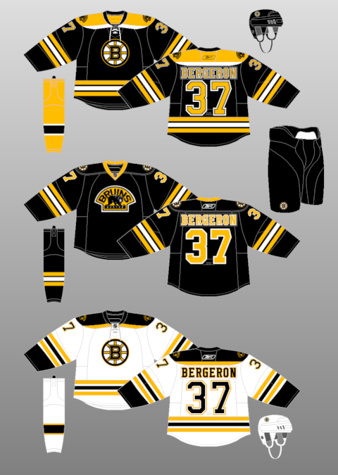 
Their current jersey is instantly recognizable as a Bruins' jersey and it has a "classic" look, even though it's not a direct copy of anything they've worn in the past.
That's something I'd like to see the Flames do.
I've often said, the recent jersey I like the most is the practice jersey they wore prior to the Heritage Classic. It didn't have the ridiculous yellow stripes, and looked really nice.

The logo pops off the jersey there. Throw some yellow and white stripes on it (and get rid of the grey), and you'd have a great Flames' jersey.
__________________
Turn up the good, turn down the suck!
|
|
|
|
|
The Following 2 Users Say Thank You to getbak For This Useful Post:
|
|
|
07-30-2014, 09:53 PM
|
#83
|
|
Lifetime Suspension
|
Quote:
Originally Posted by N-E-B
I want the best of both worlds. I want to see a new design with the retro colours. Something modern but that still has a classic feel to it.
|
Or in the reverse, I think if you took the modern colours (black included), the new shoulder patch, and stuck them on a jersey with more classic/clean lines, I think you've got a huge winner. Some cross between the new thirds and the current home jersey, leaving the worst (piping, word mark, vertical stripes) of each behind.
Either option works for me. I think most people would agree they want the jersey to have a "classic" feel to it. The current Flames jersey isn't that at all.
|
|
|
|
|
07-30-2014, 10:28 PM
|
#84
|
|
Franchise Player
|
I'm okay with black being in the mix, but I want to see it only as an accent. No more black logo.
|
|
|
|
|
The Following User Says Thank You to Alberta_Beef For This Useful Post:
|
|
|
07-30-2014, 11:21 PM
|
#85
|
|
Franchise Player
Join Date: Jul 2010
Location: Calgary - Centre West
|
That's incredibly interesting how much the yellow and white accents make the red look more orangey. But I still stand behind my opinion that the 89 jerseys were great in 1989, so let them stay there and come out for special occasions as a third jersey.
Quote:
Originally Posted by The Yen Man
Blew my mind the first time I found out too, but that's all the more reason to put some black into the home jersey. I just do not like the red, orangy yellow, and white. It makes the whole jersey look orangy-red. Having some black in the jersey makes it seem like a much nicer red. It looks ok on the away jersey since white is predominate colour, which cuts down on the whole Ronald MacDonald colour scheme.
|
x2.
__________________
-James
GO FLAMES GO.
|
|
|
|
|
The Following User Says Thank You to TorqueDog For This Useful Post:
|
|
|
07-31-2014, 12:02 AM
|
#86
|
|
First Line Centre
Join Date: Jan 2011
Location: Fort St. John, BC
|
Quote:
Originally Posted by OutOfTheCube
Also, I know teams like Buffalo and Vancouver and Dallas get ragged on for releasing new uniforms every couple years but at least those teams try to make some significant change when they do. These little changes or 'improvements' on recent 'new' jerseys like Anaheim and this new St. Louis just reek of money-grabbing. Non-fans of the team barely recognize anything different. Either keep it the same or totally re-design it -- don't just change the stripes or get rid of the piping so all the hardcore fans will come out en masse to buy one and make you money.
|
If improving your jersey is a money grab, then what does that make this?

Most teams don't try significant changes because they end up with turds like this and the Buffaslug
Last edited by doctajones428; 07-31-2014 at 12:16 AM.
|
|
|
|
|
08-01-2014, 12:32 PM
|
#87
|
|
Powerplay Quarterback
|
Quote:
Originally Posted by djsFlames
Modification to your modification.. or just me screwing around.

Black patches don't work too well, but i kept the striping and just added a whole lot of yellow instead. |
This one is pretty unique!
|
|
|
|
|
08-01-2014, 02:13 PM
|
#88
|
|
Franchise Player
Join Date: May 2009
Location: Glastonbury
|
Quote:
Originally Posted by DionTheDman
Burrows used to do it for him on "Pad Thai Tuesdays", but he can't any more since they're on different teams.
|
and finish with gentle butterfly kisses....
__________________
TC

|
|
|
|
|
08-01-2014, 03:16 PM
|
#89
|
|
Franchise Player
|
Matthew Sekeres @mattsekeres
Linden says team has looked at Johnny Canuck jerseys with Johnny as the primary logo. #Canucks
|
|
|
|
|
08-01-2014, 07:52 PM
|
#90
|
|
First Line Centre
|
Quote:
Originally Posted by Ashasx
Matthew Sekeres @mattsekeres
Linden says team has looked at Johnny Canuck jerseys with Johnny as the primary logo. #Canucks
|
The most identity crisis'ed team in NHL history. Lets throw another identity on the pile.
"We are a hockey stick in an arena, wait, we are a flying V, wait, nope, we are a skate now....uh, wait, ok now we are a whale....uh, lets go back to the hockey sticks...and while we are at it...lets change all the banners in our history to match the new colours too...no, I think we should be a pilot now....."
"...uh guys...all that stuff was dandy and such, but how about a lumberjack? Lets be lumberjacks now."
Follow-up link here ----------------> http://forum.calgarypuck.com/showthread.php?t=134696
|
|
|
|
|
08-01-2014, 07:58 PM
|
#91
|
|
First Line Centre
Join Date: Mar 2010
Location: Section 120
|
Quote:
Originally Posted by saXon
The most identity crisis'ed team in NHL history. Lets throw another identity on the pile.
"We are a hockey stick in an arena, wait, we are a flying V, wait, nope, we are a skate now....uh, wait, ok now we are a whale....uh, lets go back to the hockey sticks...and while we are at it...lets change all the banners in our history to match the new colours too...no, I think we should be a pilot now....."
"...uh guys...all that stuff was dandy and such, but how about a lumberjack? Lets be lumberjacks now."
Follow-up link here ----------------> http://forum.calgarypuck.com/showthread.php?t=134696 |
I don't understand their identity crisis. Why can't they just make a logo with a diving board and swimming pool?
|
|
|
|
|
08-01-2014, 08:27 PM
|
#92
|
|
#1 Goaltender
|
Quote:
Originally Posted by getbak
That's what I want.
It's interesting that Bingo mentions the "old Bruins" jerseys because they actually made some significant changes to their look with the Edge re-design.
You can look at their historical uniforms here: http://nhluniforms.com/Bruins/Bruins.html
Their current jerseys were obviously inspired by the Orr-era design, but it is not a direct copy (especially the white).
Their current jersey is instantly recognizable as a Bruins' jersey and it has a "classic" look, even though it's not a direct copy of anything they've worn in the past.
That's something I'd like to see the Flames do.
I've often said, the recent jersey I like the most is the practice jersey they wore prior to the Heritage Classic. It didn't have the ridiculous yellow stripes, and looked really nice.
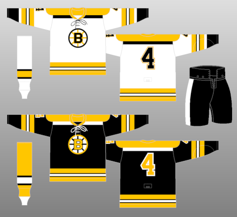
The logo pops off the jersey there. Throw some yellow and white stripes on it (and get rid of the grey), and you'd have a great Flames' jersey. |
Replace the grey with Black and it might look really good. I'd change those socks too... not sure how, but change them.
|
|
|
|
|
08-01-2014, 08:41 PM
|
#93
|
|
Franchise Player
Join Date: Feb 2006
Location: Calgary, AB
|
Canucks uniform history ( http://nhluniforms.com/Canucks/Canucks.html): - Original Stick in Rink logo: 1970-71 to 1977-78 (8 seasons)
- Flying V: 1978-79 to 1984-85 (7 seasons)
- Yellow home jersey Psychedelic Skate: 1985-86 to 1988-89 (4 seasons)
- White home jersey Psychedelic Skate: 1989-90 to 1996-97 (8 seasons)
- Blue and Red Orca: 1997-98 to 2006-07 (10 seasons / 9, with lockout)
- Blue and Green Orca: 2007-08 to 2014-15 (8 seasons)
Yup, seems like they're about due for another total overhaul.
__________________
Turn up the good, turn down the suck!
|
|
|
|
|
08-01-2014, 08:47 PM
|
#94
|
|
Franchise Player
|
Quote:
Originally Posted by getbak
White home jersey Psychedelic Skate: 1989-90 to 1996-97 (8 seasons)
|
I actually liked the black road jersey with the Psychedelic Skate. That logo in general was neat.
Mind you I also didn't hate the Canucks at the time either.
|
|
|
|
|
The Following 2 Users Say Thank You to DownhillGoat For This Useful Post:
|
|
|
08-01-2014, 08:55 PM
|
#95
|
|
Franchise Player
Join Date: Mar 2004
Location: Chilliwack, B.C
|
Quote:
Originally Posted by kunkstyle
I actually liked the black road jersey with the Psychedelic Skate. That logo in general was neat.
Mind you I also didn't hate the Canucks at the time either.
|
I agree that was in my mind the best home/away uniform they ever had
|

|
|
|
09-23-2014, 01:36 PM
|
#96
|
|
Franchise Player
|

Caps Winter Classic jersey. I think I hate them, but I'm not entirely sure yet.
__________________
Quote:
Originally Posted by CroFlames
Before you call me a pessimist or a downer, the Flames made me this way. Blame them.
|
|
|
|
|
|
09-23-2014, 01:37 PM
|
#97
|
|
Franchise Player
Join Date: Mar 2009
Location: Calgary
|
Fake history = no good
|
|
|
|
|
09-23-2014, 01:40 PM
|
#98
|
|
Franchise Player
Join Date: Feb 2007
Location: Calgary, AB
|
I like the jersey themselves...not a fan of the logo.
|
|
|
|
|
09-23-2014, 06:18 PM
|
#99
|
|
Franchise Player
Join Date: Dec 2011
Location: Calgary
|
Terrible
|
|
|
|
|
09-23-2014, 06:37 PM
|
#100
|
|
Franchise Player
Join Date: Feb 2006
Location: Calgary, AB
|
If they had put their "W" eagle over the Capitol logo on the front of it, that would have been their best jersey.
__________________
Turn up the good, turn down the suck!
|
|
|
|
 Posting Rules
|
You may not post new threads
You may not post replies
You may not post attachments
You may not edit your posts
HTML code is Off
|
|
|
All times are GMT -6. The time now is 08:44 AM.
|
|


