07-28-2014, 02:22 PM
|
#21
|
|
Powerplay Quarterback
Join Date: Sep 2010
Location: Calgary
|
Quote:
Originally Posted by Ashasx

I haven't done this in a while...
I will keep fighting.
|
I actually like that. I'm a big fan of different/unique looking jersey's though.
|

|

|
|
The Following User Says Thank You to flamesfan55 For This Useful Post:
|
|
|
07-28-2014, 03:10 PM
|
#22
|
|
Franchise Player
|
w/o the piping:


I think it'd look great w/o the shoulder patches as well.
Last edited by mile; 07-28-2014 at 03:15 PM.
|
|
|
|
|
The Following 5 Users Say Thank You to mile For This Useful Post:
|
|
|
07-28-2014, 03:30 PM
|
#23
|
|
Franchise Player
Join Date: Oct 2006
Location: Calgary
|
Quote:
Originally Posted by Ashasx
I haven't done this in a while...
I will keep fighting.
|
Those are so good that if someone could make one of each I'd buy one even though they aren't legit.
__________________
Fireside Chat - The #1 Flames Fan Podcast - FiresideChat.ca
|
|
|
|
|
The Following 4 Users Say Thank You to Caged Great For This Useful Post:
|
|
|
07-28-2014, 03:31 PM
|
#24
|
|
Powerplay Quarterback
|
I don't understand all the love for the shoulder patches from the 3rds. They look worse than the current flags, and do not fit the theme in the above jersey any better. If you have a logo, keep a logo, don't adorn your jersey with 2 logos because thats just silly. And, if I can criticize, that jersey in the post above just looks like a rehashed '03-04, which, since we are throwing out opinions, is the second worst jersey after the pedestals.
Count me in the group that likes the vertical lines on jerseys and piping as well. It looks sharp that it integrates into the pants, the red and black are great together on it, and the 3 colour letter/numbers look good
|
|
|
|
|
07-28-2014, 03:34 PM
|
#25
|
|
Lifetime Suspension
Join Date: Jul 2003
Location: Calgary, Alberta
|
Quote:
Originally Posted by mile
w/o the piping:
I think it'd look great w/o the shoulder patches as well.
|
This is beautiful.
|
|
|
|
|
07-28-2014, 03:46 PM
|
#26
|
|
Lifetime Suspension
|

Quote:
Originally Posted by Aleks
I don't understand all the love for the shoulder patches from the 3rds. They look worse than the current flags, and do not fit the theme in the above jersey any better. If you have a logo, keep a logo, don't adorn your jersey with 2 logos because thats just silly. And, if I can criticize, that jersey in the post above just looks like a rehashed '03-04, which, since we are throwing out opinions, is the second worst jersey after the pedestals.
Count me in the group that likes the vertical lines on jerseys and piping as well. It looks sharp that it integrates into the pants, the red and black are great together on it, and the 3 colour letter/numbers look good
|
Just to nitpick, you're saying that a logo that contains the Flames colour scheme looks just as bad as two different flags, one containing a different red, and the other containing blue?
I'd agree that a jersey can look great without shoulder patches, but Chicago, Toronto, and Boston have great looking jerseys, and they have shoulder patches. It certainly isn't what makes or breaks the silliness of a jersey.
Isn't the 03-04 jersey commonly regarded as the second BEST jersey after the originals?
|
|
|
|
|
The Following User Says Thank You to Chill Cosby For This Useful Post:
|
|
|
07-28-2014, 03:53 PM
|
#27
|
|
Franchise Player
|
Quote:
Originally Posted by Chill Cosby
Just to nitpick, you're saying that a logo that contains the Flames colour scheme looks just as bad as two different flags, one containing a different red, and the other containing blue?
I'd agree that a jersey can look great without shoulder patches, but Chicago, Toronto, and Boston have great looking jerseys, and they have shoulder patches. It certainly isn't what makes or breaks the silliness of a jersey.
Isn't the 03-04 jersey commonly regarded as the second BEST jersey after the originals?
|
Agreed. The red on these jerseys is phenomenal.

I like the ones Ashasx posted as well, if the font resembled the ones on Chicago's or Philadelphia's jerseys it would be at the top of the league.
Last edited by mile; 07-28-2014 at 03:58 PM.
|
|
|
|
|
07-28-2014, 04:53 PM
|
#28
|
|
Franchise Player
|
Also, I know teams like Buffalo and Vancouver and Dallas get ragged on for releasing new uniforms every couple years but at least those teams try to make some significant change when they do. These little changes or 'improvements' on recent 'new' jerseys like Anaheim and this new St. Louis just reek of money-grabbing. Non-fans of the team barely recognize anything different. Either keep it the same or totally re-design it -- don't just change the stripes or get rid of the piping so all the hardcore fans will come out en masse to buy one and make you money.
|
|
|
|
|
The Following User Says Thank You to OutOfTheCube For This Useful Post:
|
|
|
07-28-2014, 04:58 PM
|
#29
|
|
Franchise Player
Join Date: Aug 2007
Location: Ontario
|
Lol, you guys rock. You can't understand how much of a dream come true it would be to see my jersey on someone's back.
That you guys keep pulling it out of the woodwork is honestly an immense honour. Thank you.
|
|
|
|
|
The Following 12 Users Say Thank You to Split98 For This Useful Post:
|
Ashasx,
bax,
Beer-gut Murray,
BigFlameDog,
Coach,
DaQwiz,
EYE_Overstand,
flamesfan1297,
FlameZilla,
indes,
the2bears,
Trailer Fire
|
|
07-28-2014, 05:04 PM
|
#30
|
|
Franchise Player
Join Date: Aug 2007
Location: Ontario
|
Quote:
Originally Posted by Otto-matic
|
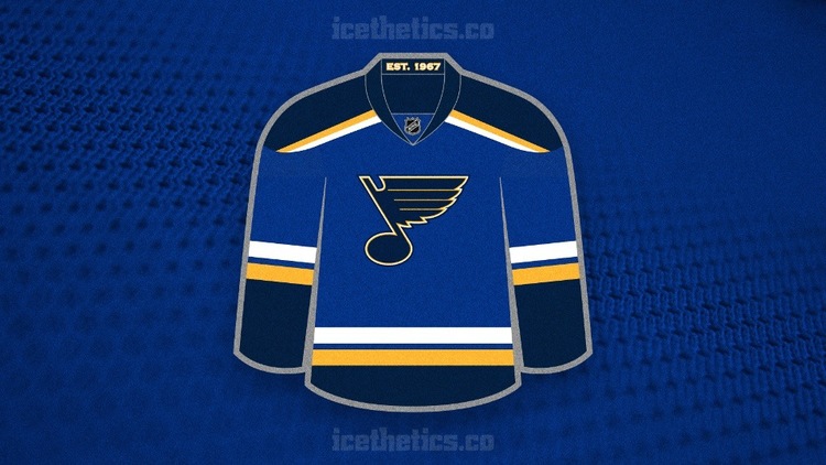
HUGE step in the right direction in de-Edging the NHL. Not an extreme difference, for sure, but absolutely an attractive team.
Now for Calgary, Ottawa and Pittsburgh (am I missing someone?) to clean up their threads and we will have a pretty damn attractive NHL.
Here's a few other Blues options going forward that caught my eye:
Edit: Coming back to this thread a couple times I hate this 2nd jersey concept... so removed.
Last edited by Split98; 07-28-2014 at 08:14 PM.
|
|
|
|
|
07-28-2014, 05:11 PM
|
#31
|
|
Powerplay Quarterback
|
I'm glad hockey jerseys are moving back towards simpler design schemes. I think the more minimal jerseys are almost always the best.
It's infuriating how everyone acknowledges that our retro's are clearly phenomenal jerseys, but whoever is actually in charge of that decision seems to be about the only person out there who disagrees.
__________________
Always Earned, Never Given
|
|
|
|
|
07-28-2014, 06:29 PM
|
#32
|
|
First Line Centre
Join Date: Oct 2009
Location: Reppin' the C in BC
|
Quote:
Originally Posted by RM14
Time for Calgary to follow suit and make similar changes to our jersey by removing the vertical piping and cleaning it up a bit.
|
and get rid of the flags, leave it blank if you can't come up with a logo
__________________
"There are no asterisks in this life, only scoreboards." - Ari Gold
12 13 14 2 34
|
|
|
|
|
07-28-2014, 07:49 PM
|
#33
|
|
Franchise Player
Join Date: Jun 2006
Location: Calgary, Alberta
|
I feel the Flames new thirds without the black shoulders, and the 'C' logo rather than the wordmark would be good look for the primaries. On the away's the shoulders could be red.
|
|
|
|
|
The Following User Says Thank You to Joborule For This Useful Post:
|
|
|
07-28-2014, 09:12 PM
|
#34
|
|
Franchise Player
Join Date: Nov 2002
Location: Hamilton, Ontario
|
__________________
2018 OHL CHAMPIONS
2022 OHL CHAMPIONS
|
|
|
|
|
The Following User Says Thank You to Hanna Sniper For This Useful Post:
|
|
|
07-28-2014, 10:04 PM
|
#35
|
|
Franchise Player
|
Does anyone have the mock of the old retro thirds with the new shoulder patch on it? I loved the look of that.
__________________
Quote:
Originally Posted by CroFlames
Before you call me a pessimist or a downer, the Flames made me this way. Blame them.
|
|
|
|
|
|
07-28-2014, 11:07 PM
|
#36
|
|
Scoring Winger
Join Date: Jul 2011
Location: at home
|
Quote:
Originally Posted by codynw
Does anyone have the mock of the old retro thirds with the new shoulder patch on it? I loved the look of that.
|
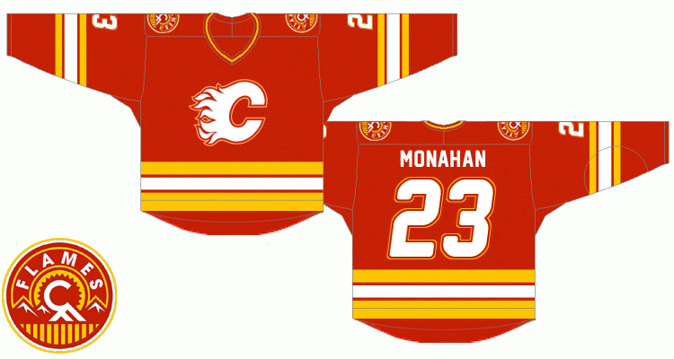
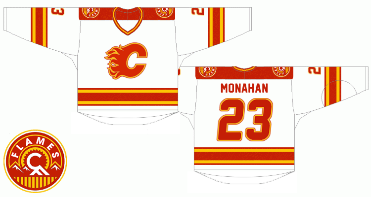
here's my concept from the 'Ken King please read' thread
|
|
|
|
|
The Following 22 Users Say Thank You to playmaker For This Useful Post:
|
Bingo,
Burke Salad,
calgaryred,
chalms04,
codynw,
ComixZone,
davidus_49,
Gallick,
handgroen,
Itse,
Joborule,
JoelOtto29,
Larry David,
M*A*S*H 4077,
Point Blank,
saskflames69,
Swayze11,
The Professor,
TheJoeGreene,
the_only_turek_fan,
TjRhythmic,
tripin_billie
|
|
07-28-2014, 11:14 PM
|
#37
|
|
Franchise Player
|
Quote:
Originally Posted by playmaker
here's my concept from the 'Ken King please read' thread
|
This is perfect.
|
|
|
|
|
The Following 3 Users Say Thank You to ComixZone For This Useful Post:
|
|
|
07-28-2014, 11:52 PM
|
#38
|
|
Franchise Player
|
Quote:
Originally Posted by playmaker
here's my concept from the 'Ken King please read' thread
|
This is exactly the one I was looking for. This would make an amazing jersey. The shoulder patch looks so good in those colours..
__________________
Quote:
Originally Posted by CroFlames
Before you call me a pessimist or a downer, the Flames made me this way. Blame them.
|
|
|
|
|
|
07-29-2014, 02:01 AM
|
#39
|
|
Powerplay Quarterback
|
Quote:
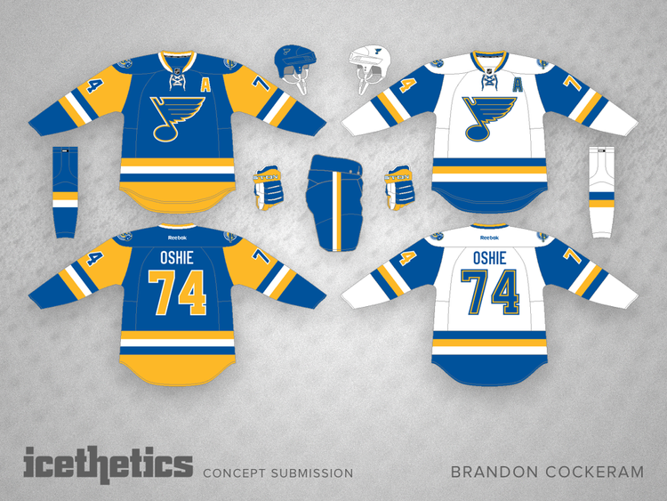
Originally Posted by Ashasx
I haven't done this in a while...
I will keep fighting.
|
This is the first time I saw this and it looks really really really good. I'd go out of my way to buy one and have it shipped here if that becomes our jersey.
Last edited by Point Blank; 07-29-2014 at 02:35 AM.
|
|
|
|
|
The Following User Says Thank You to Point Blank For This Useful Post:
|
|
|
07-29-2014, 02:05 AM
|
#40
|
|
Lifetime Suspension
|
Quote:
Originally Posted by Split98
HUGE step in the right direction in de-Edging the NHL. Not an extreme difference, for sure, but absolutely an attractive team.
Now for Calgary, Ottawa and Pittsburgh (am I missing someone?) to clean up their threads and we will have a pretty damn attractive NHL.
Here's a few other Blues options going forward that caught my eye:
Edit: Coming back to this thread a couple times I hate this 2nd jersey concept... so removed. |
Modified those for a Flames version:

Looked a bit off at first, but I'm really coming around to it! Maybe I'll do the aways too.
|
|
|
|
|
The Following User Says Thank You to Obsidian For This Useful Post:
|
|
 Posting Rules
|
You may not post new threads
You may not post replies
You may not post attachments
You may not edit your posts
HTML code is Off
|
|
|
All times are GMT -6. The time now is 01:44 PM.
|
|