 05-22-2017, 10:04 PM
|
#1741
|
|
Franchise Player
|
I really like the above. Great work.
|

|

|
|
The Following User Says Thank You to Da_Chief For This Useful Post:
|
|
|
05-22-2017, 10:08 PM
|
#1742
|
|
Not a casual user
Join Date: Mar 2006
Location: A simple man leading a complicated life....
|
Quote:
Originally Posted by Scary Eloranta

Curious to hear your guys (and gals) opinion on this.... (maybe a bit too much "out there"?)
 |
Send a copy to Ken King stat!
__________________

|
|
|
|
|
05-22-2017, 10:10 PM
|
#1743
|
|
Powerplay Quarterback
Join Date: Dec 2009
Location: Tokyo, Japan
|
Quote:
Originally Posted by Scary Eloranta
Curious to hear your guys (and gals) opinion on this.... (maybe a bit too much "out there"?)
|
These are pretty nice. Not sure if it is the professional presentation that helps out a lot though.
My take: Nice mix of the retro colours with some hints of the post-pedestal whites, horsehead blacks, and 2004 on reds via the V-shaped striping. One thing I don't like is the shoulders on the away jerseys. The red shoulders are my favourite feature of the retro whites. The way the panels are on the arms mean that the back numbers and the sleeve numbers will be different colours. Sometimes this looks ok (Colorado does it, Pittsburgh has it on their retros) but the Flames have never had that style. I would prefer the white and red were switched on the sleeves of both jerseys. Then on the whites you could have the red shoulders and this would also give some continuity to the sleeves and bottom striping on the body.
|
|
|
|
|
The Following 2 Users Say Thank You to P-DAZZLE For This Useful Post:
|
|
|
05-22-2017, 10:18 PM
|
#1744
|
|
Powerplay Quarterback
|
Thx P-Dazzle, that idea might have potential. Will try when I get a chance!
|
|
|
|
|
The Following User Says Thank You to Scary Eloranta For This Useful Post:
|
|
|
05-22-2017, 10:27 PM
|
#1746
|
|
Powerplay Quarterback
Join Date: Dec 2009
Location: Tokyo, Japan
|
Quote:
Originally Posted by Scary Eloranta
Thx P-Dazzle, that idea might have potential. Will try when I get a chance!
|
Other thoughts: I'd also be interested in seeing the Vs on the sleeves point downwards instead of upwards and I think they would look good with more traditional centre-striped socks. Love the collar and the pants.
|
|
|
|
|
05-22-2017, 10:58 PM
|
#1747
|
|
Franchise Player
Join Date: Sep 2002
Location: I'm right behind you
|
Quote:
Originally Posted by Howie_16
Came across this picture tonight. Suggests that a newly designed Flames jersey may already be in the works?
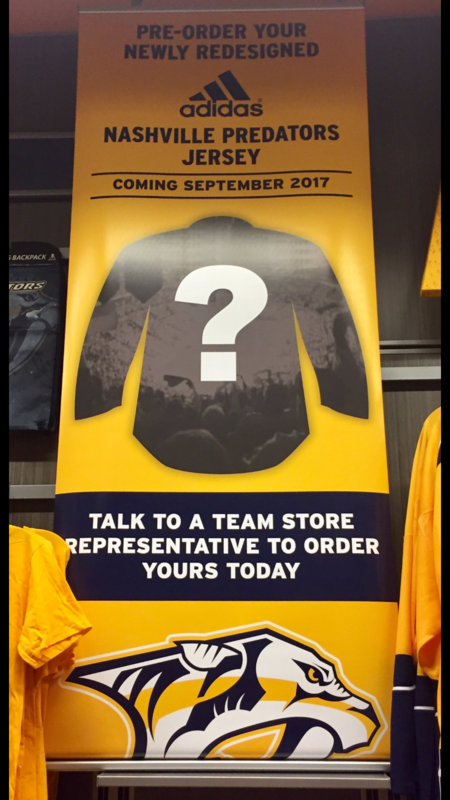 |
Every NHL team is getting redesigned jerseys for Adidas branding. How much each jersey is changing is up for debate but each team will be using their new jersey for the draft.
__________________
Don't fear me. Trust me.
|
|
|
|
|
05-23-2017, 12:13 AM
|
#1748
|
|
Crash and Bang Winger
Join Date: May 2009
Location: Calgary
|
Quote:
Originally Posted by Scary Eloranta
Curious to hear your guys (and gals) opinion on this.... (maybe a bit too much "out there"?)
|
Yep too out there. No likey. But you have the best artistic skills for doing jersey designs I've ever seen! I always look forward to your posts.
Save
__________________
The Doctor is in
|
|
|
|
|
05-23-2017, 12:37 AM
|
#1749
|
|
Franchise Player
Join Date: Dec 2011
Location: Calgary
|
I think those are beauties. Some modern classics. They're unique and a bit different, but not pedestal or horsehead different. I like em. Bonus points for not screwing with the original C by adding an extra border.
|
|
|
|
|
The Following User Says Thank You to N-E-B For This Useful Post:
|
|
|
05-23-2017, 07:06 AM
|
#1750
|
|
Powerplay Quarterback
Join Date: Dec 2006
Location: Canada
|
Quote:
Originally Posted by Scary Eloranta
Curious to hear your guys (and gals) opinion on this.... (maybe a bit too much "out there"?)
|
I like them a lot, well done. I would change the yellow trim, instead of coming to a point, I'd like to see them just going straight across like the retro jersey's. Also the gloves need a little bit of white on in somewhere.
__________________

Last edited by FireItUp; 05-23-2017 at 07:08 AM.
|
|
|
|
|
05-23-2017, 07:15 AM
|
#1751
|
|
Franchise Player
|
Quote:
Originally Posted by Scary Eloranta
Curious to hear your guys (and gals) opinion on this.... (maybe a bit too much "out there"?)
|
|
|
|
|
|
The Following 3 Users Say Thank You to Roof-Daddy For This Useful Post:
|
|
|
The Following 54 Users Say Thank You to Scary Eloranta For This Useful Post:
|
bax,
bc-chris,
bigrangy,
calgaryred,
ClubFlames,
Coach,
cofias,
Demaeon,
doublej_23,
drew24,
drewtastic,
DT77,
FacePaint,
FFFLife,
FireItUp,
Flamesfan2010,
Flames_F.T.W,
foofighter15,
handgroen,
HockeyPuck,
indes,
Iveman,
jammies,
JBR,
Jimmy Stang,
Joborule,
JonDuke,
lambeburger,
MisterJoji,
moncton golden flames,
Otto-matic,
redflamesfan08,
Redliner,
Reign of Fire,
Rhettzky,
ricosuave,
Roof-Daddy,
Saint Troy,
saXon,
SmoggyFlamesFan,
socalwingfan,
SOMBRI2,
Split98,
SportsJunky,
Tacopuck,
TheScorpion,
the_only_turek_fan,
TjRhythmic,
Toonage,
Tyler,
united,
Yamer,
YYC in LAX,
Zarley
|
|
05-23-2017, 11:22 AM
|
#1753
|
|
Franchise Player
Join Date: Mar 2004
Location: 161 St. - Yankee Stadium
|
Quote:
Originally Posted by Scary Eloranta
as per feedback....
 |
Best I've seen yet. Sadly, as we're only a few weeks from the NHL Draft.. it's very likely that the "We're going to hate these for another 10 years" Adidas threads are already locked, loaded and ready to unveil.
|
|
|
|
|
The Following User Says Thank You to JBR For This Useful Post:
|
|
|
05-23-2017, 11:23 AM
|
#1754
|
|
Taking a while to get to 5000
|
Yep, just watch it be the exact same jerseys that they are wearing now but with an Adidas logo.
|
|
|
|
|
The Following 2 Users Say Thank You to Toonage For This Useful Post:
|
|
|
05-23-2017, 11:27 AM
|
#1755
|
|
Franchise Player
Join Date: Dec 2003
Location: Sector 7-G
|
Quote:
Originally Posted by Toonage
Yep, just watch it be the exact same jerseys that they are wearing now but with an Adidas logo.
|
Sounds like that's what Anaheim is doing.
Quote:
|
Ducks GM Bob Murray: "Were going to go to a new jersey the year after next." New primary jerseys to be orange;
|
|
|
|
|
|
05-23-2017, 11:31 AM
|
#1756
|
|
That Crazy Guy at the Bus Stop
Join Date: Jun 2010
Location: Springfield Penitentiary
|
Good work and concept. I preferred the first one. Except one major snag I will never get on board with (and I think I've mentioned in this thread before).
The color below the waist stripe should never be all white like that. Very bad look. I don't mind some white there, but as stripe, not the weird diaper look it creates by having the entire bottom section white. I don't like that design on the away either, even though it is red below the waist.
The white bottom portion on the home and the red bottom portion on the away should be a stripe, not a total color flip below the yellow.
On the home it should go red (primary), yellow stripe, red, white stripe, red.
|
|
|
|
|
The Following 2 Users Say Thank You to Cecil Terwilliger For This Useful Post:
|
|
|
05-23-2017, 11:36 AM
|
#1757
|
|
Franchise Player
Join Date: Aug 2007
Location: Ontario
|
Quote:
Originally Posted by Scary Eloranta
as per feedback....
|
I really like these!
I've been playing around with the 2004 v-striping on retro colours as well, and would love to see these arms with the v-striping you had on the last one. How did that look?
|
|
|
|
|
05-23-2017, 11:37 AM
|
#1758
|
|
Jordan!
Join Date: Jul 2009
Location: Chandler, AZ
|
Quote:
Originally Posted by Dion
Send a copy to Ken King stat!
|
Damn, those look amazing
|
|
|
|
|
05-23-2017, 11:47 AM
|
#1759
|
|
Franchise Player
Join Date: Aug 2007
Location: Vancouver
|
Quote:
Originally Posted by Scary Eloranta
|
I think if you now added the angled stripes of the 04 jersey you could have that merge you're looking for.
Would buy.
__________________

|
|
|
|
|
The Following 2 Users Say Thank You to Coach For This Useful Post:
|
|
|
05-23-2017, 12:39 PM
|
#1760
|
|
Franchise Player
|
Quote:
Originally Posted by Scary Eloranta
as per feedback....
|
I think the circular shoulder pad on the aways looks a little odd. Nothing else similar at all in the design.
Same with the original design.
Last edited by Ashasx; 05-23-2017 at 12:41 PM.
|
|
|
|
 Posting Rules
|
You may not post new threads
You may not post replies
You may not post attachments
You may not edit your posts
HTML code is Off
|
|
|
All times are GMT -6. The time now is 11:12 AM.
|
|


